Health AI SaaS · 08 / 11 · web application
AI Webapp for doctors
The review workspace Twin Health's endocrinologists use to clear 25–30 member reviews a day — the data, the suggestion and its reasoning on one screen.
- Review time
- 14.2 → 8.6 min
- Cleared same day
- 64% → 86%
- Panel per doctor
- ~300 → ~400
- Pilot
- 14 clinicians
Overview
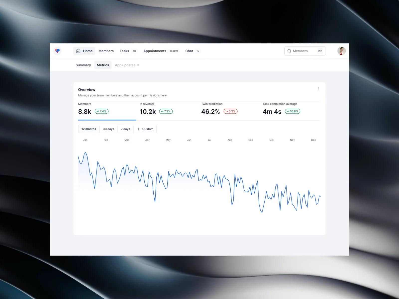
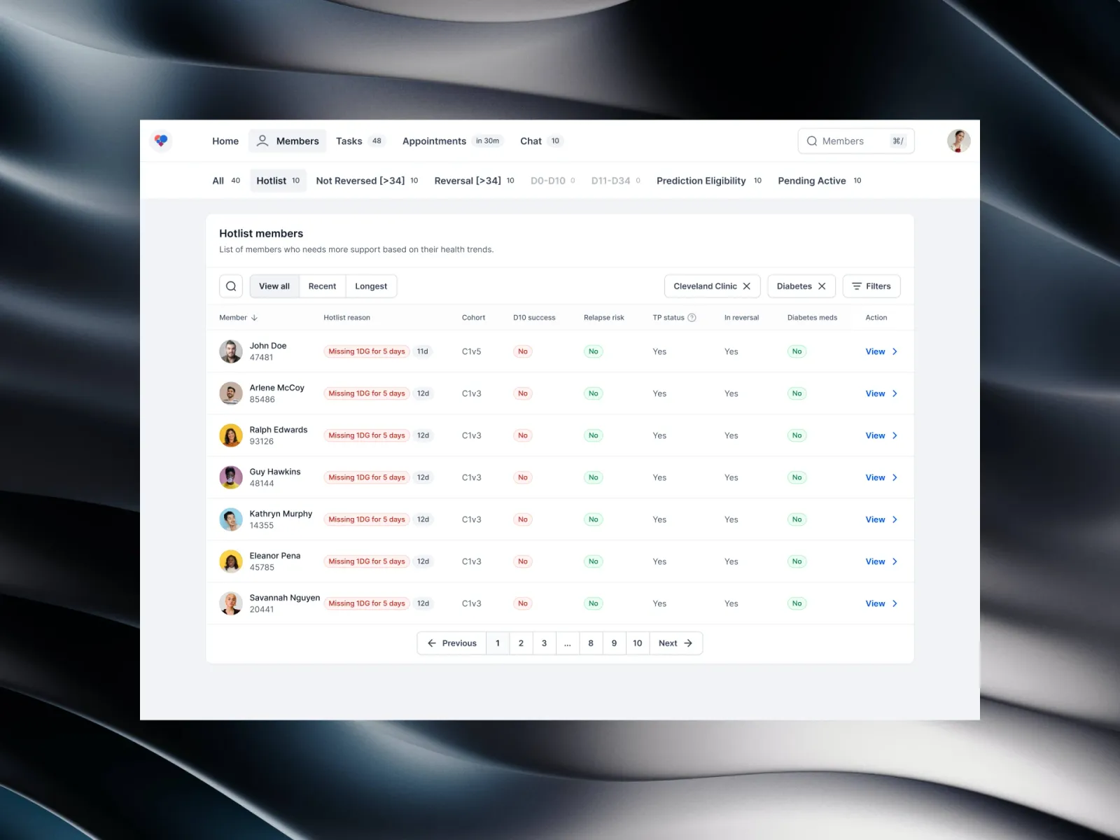
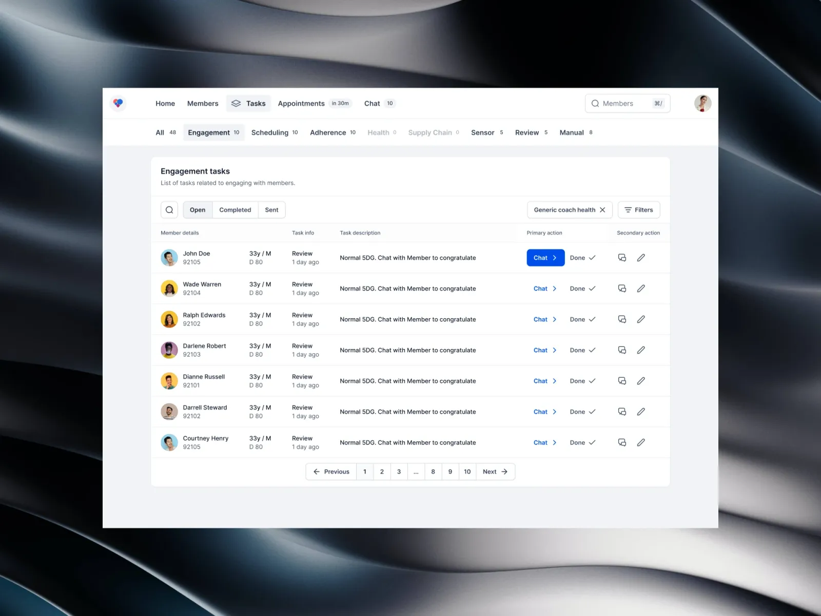
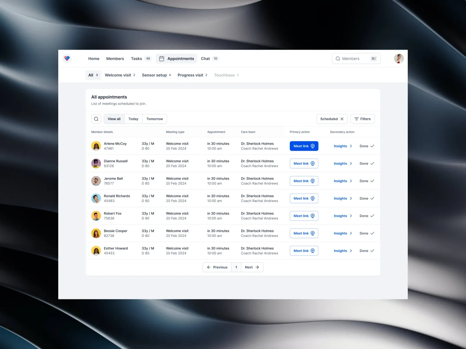
This is the workspace Twin Health's doctors use to review members on the Type 2 diabetes reversal program. It puts sensor readings, lab results, the care team's notes and the system's suggestions on one screen, so a doctor can review a member, make a decision and move on without opening anything else.
The problem: Our endocrinologists were reviewing 25–30 members a day across the hospital EHR, a glucose dashboard, a messaging tool and a spreadsheet of pending tasks. A single review meant eight to twelve windows, and most of the time went on finding things rather than deciding anything.
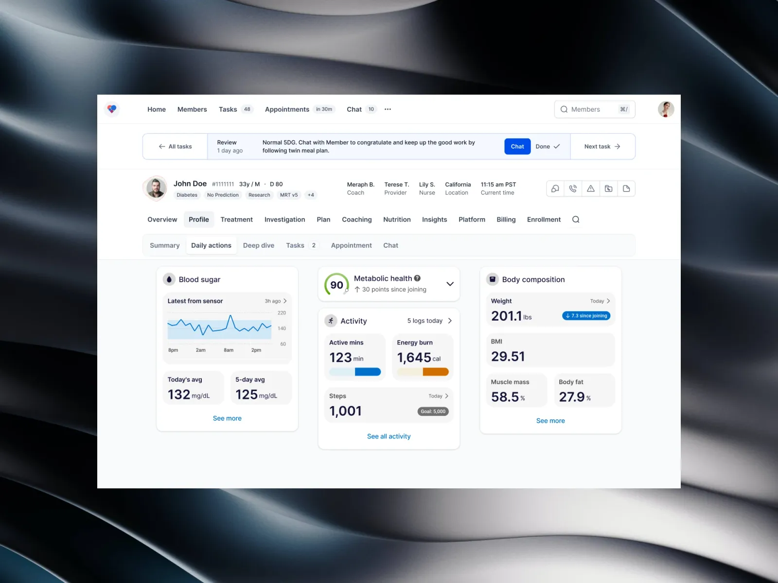
What we built: A review queue with a fixed action bar on top — Chat, Done, Next — a header that says who the member is and who else on the team is looking after them, and cards for glucose, metabolic score, activity and body composition underneath. Suggestions show the readings behind them, and doctors can always override them.
Who it's for:
- Primarily: diabetologists, endocrinologists and telehealth physicians.
- Also: nurse care coordinators, health coaches and diabetes educators working on the same members.
Suggested
Reduce Metformin from 500 mg twice a day to once a day.
In range 86% of the last five days, with no lows.
128 mg/dL
In range 86% of the time
14 minutes ago
Competitor research & benchmarking
Before designing anything, we timed how review actually worked in the tools our clinicians already had: the hospital EHR and the standalone coaching and glucose apps some of them used alongside it.
What we took from it:
- Too many windows. In the EHR, one review took eight to twelve windows and 14.2 minutes on average. Most of that was looking, not deciding.
- Apps don't talk to the record. The standalone apps had good glucose data, but nothing went back into the EHR, so numbers were re-typed by hand.
- One screen helps, but not magically. Bringing everything onto one screen with keyboard shortcuts got review time down to about 8.6 minutes in the pilot — a real gain, not a miracle.
User interviews & qualitative synthesis
We interviewed 18 clinicians at three clinics: 7 endocrinologists and diabetologists, 6 nurse care coordinators and 5 nutritionists. Each session was about 45 minutes, mostly spent watching them work through real (de-identified) reviews.
We wrote about 120 notes from the sessions and grouped them by theme. Four problems came up again and again.
- Too many tabs per chart (16 of 18). People were tired from hunting for data. "By the twentieth patient I'm running on fumes."
- Real alerts lost in the noise (14 of 18). Forty-odd sensor pings arrived every morning, most of them a loose patch, and the urgent one was somewhere in the middle.
- No trust in unexplained advice (12 of 18). Doctors wouldn't act on a dose suggestion unless the readings behind it were right next to the button.
- The team doesn't share notes (11 of 18). Coaches, nurses and doctors kept separate notes, so members were asked the same questions twice.
Enterprise personas
From the interviews and six days of shadowing, two people stood out as the ones the design had to work for first.
Dr. Aris Thorne, MD — the doctor
Aris is an endocrinologist with about 400 members. He does 25–30 reviews before afternoon clinic and gets roughly five minutes for each.
- What he needs: see time in range at a glance, understand why the system is suggesting a change, and reduce medication safely when the readings allow.
- What the design gives him: a fixed action bar, keyboard shortcuts for the queue (
J/K,⌘/to search) and the reasoning beside every suggestion.
Elena Rostova, RN — the coordinator
Elena is a nurse care coordinator looking after about 250 members with a coach and a doctor. A lot of her day is chasing devices that stopped syncing and lab results that arrive as faxed PDFs.
- What she needs: know which devices need attention, keep the coach's notes and the doctor's orders in step, and catch early warning signs before they become urgent.
- What the design gives her: battery and last-sync badges, one shared care-team timeline, and the member's local time so nobody gets messaged at 2am.
Information architecture & OOUX entity model
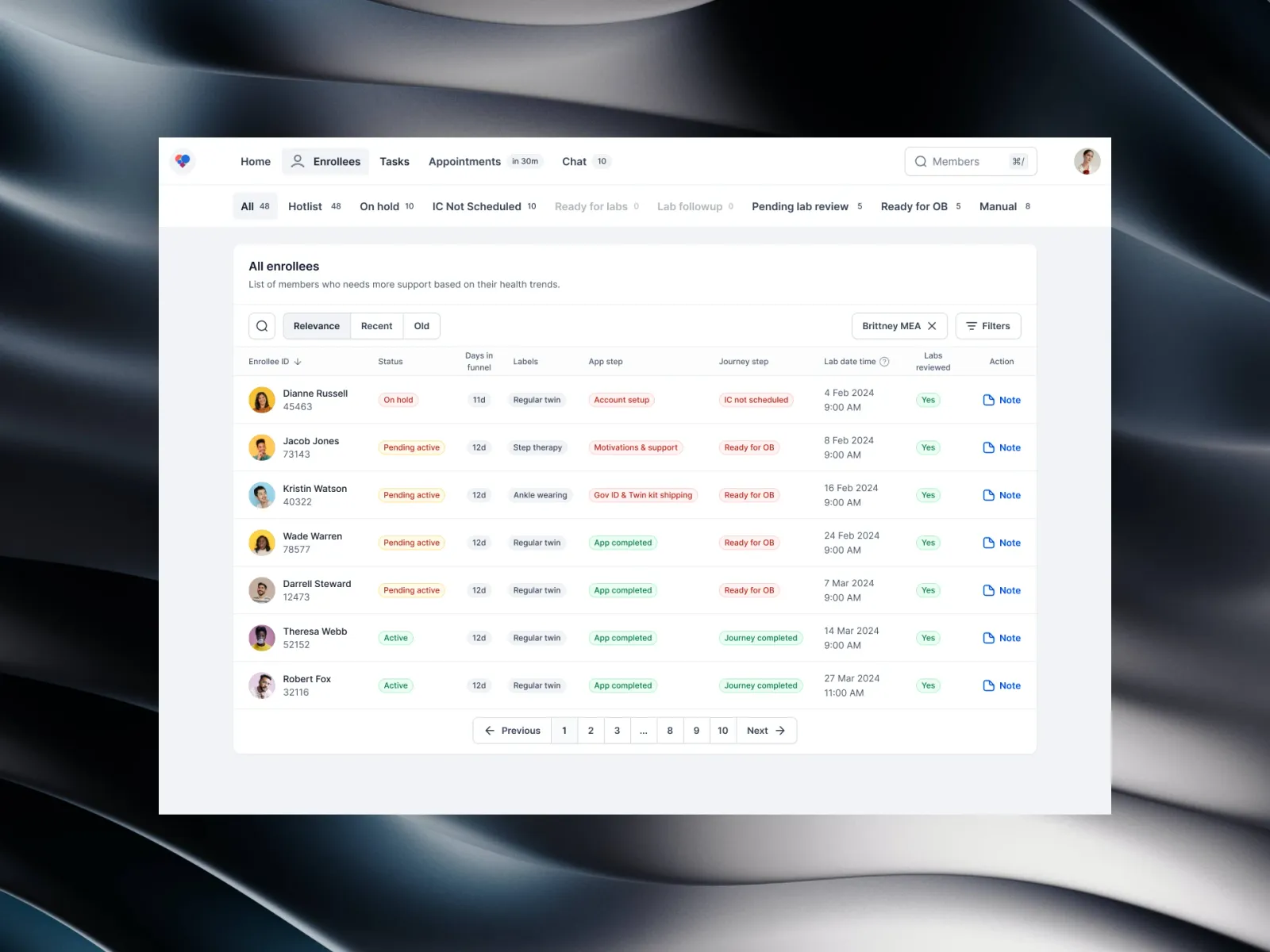
We mapped the objects the workspace deals with — organisations, clinics, care teams, members, readings, suggestions and review tasks — and how they relate, before drawing screens. It kept the navigation honest: every screen is about one of these objects.
In short:
- Organisation and clinic set the rules: which protocols apply and where records are sent.
- Care team is a doctor, a nurse coordinator and a coach, sharing one timeline.
- Member holds everything about one person: condition, program day, scores and history.
- Device readings come in from the glucose sensor, scale, blood pressure cuff and food log.
- Suggestions and the review queue turn readings into a short list of decisions for a person to make.
Wireframe iterations & layout evolution
We tested three layouts as clickable wireframes with 12 clinicians, over three rounds, before writing production code.
Layout A: a data grid (dropped — SUS 52)
A dense table with expandable rows. Familiar, but sixty-odd rows of the same weight were tiring to scan, high readings sat inside collapsed rows, and acting on one row took four clicks. Reviews took about 13 minutes in testing.
Layout B: a step-by-step modal (dropped — SUS 61)
One member at a time, in a modal. It was calm, but it covered history and labs, and answering a nurse's message meant losing your place. Experienced doctors found the fixed order slow. About 11 minutes per review.
Layout C: an action bar with cards (shipped — SUS 79)
A fixed action bar on top and cards underneath. The chart and the actions stay visible, and Chat, Done and Next are one tap each. About 9 minutes per review in testing, and 10 of the 12 testers preferred it.
Stateful task flow & decision logic
Most readings never need a person. We drew the flow as a set of states so that the ones that do reach the right person, with the context already attached.
How a reading moves:
- In range (under 140 mg/dL): the member gets an encouraging nudge in the app and nobody else is bothered.
- Drifting: it goes to the health coach, who looks at meals and follows up by chat.
- Urgent (very high, or a fast drop below 70 mg/dL): it goes to the top of the doctor's queue with the suggestion and its reasoning.
- Doctor decides: Done signs the change, writes it back to the EHR and texts the member; an override asks for a short reason and records it.
Interactive prototype & keyboard ergonomics
The prototype at the top of this page is a working slice of the review queue. Try Done and Next; it's the same rhythm doctors use.
- Search (
⌘/): find a member by name, phone number or ID. - Move through the queue (
J/K): previous and next without reaching for the mouse. - Done (
⌘↵): accept the suggestion, write it back and move on. - Chat (
C): open a message to the member with the relevant readings attached.
High-fidelity production UI
The shipped design keeps a lot of information on screen while making it obvious what to look at first.
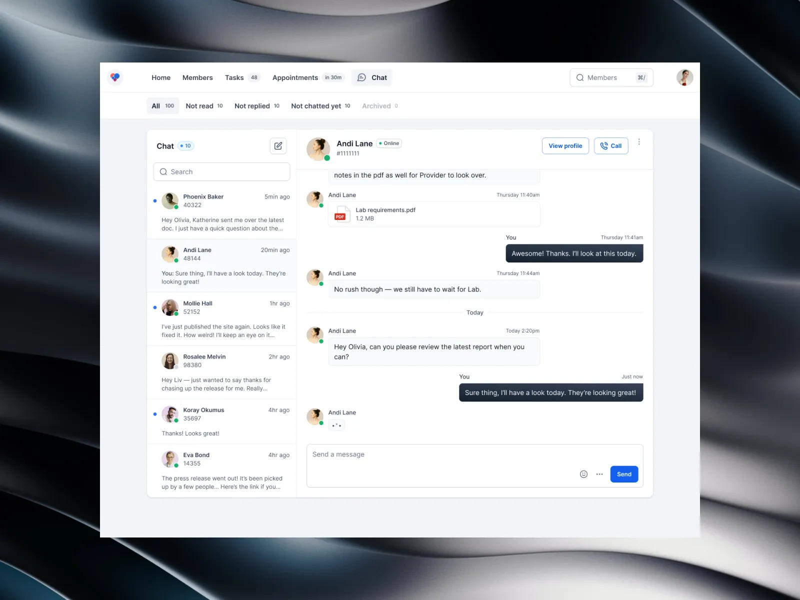
Navigation & member context
The top bar has search, unread messages and how many reviews are waiting. The member header shows their condition, program day, care team and local time.
Cards
Each card answers one question:
- Glucose: the last 24 hours against the 70–140 mg/dL target band, when it last synced, and the five-day average.
- Metabolic score: a single score that moves slowly — 72 for this member, up 9 since joining.
- Activity: active minutes and steps against the member's goal.
- Body composition: weight (down 7 lb), BMI, muscle and body fat over time.
Going deeper
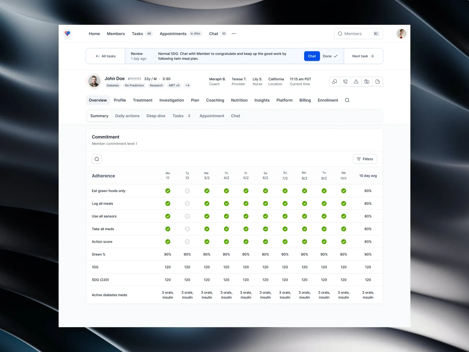
When a doctor needs more, the panel opens multi-week trends and lab results alongside, so a decision to reduce medication can be checked without leaving the review.
A/B testing, experimentation & telemetry
We ran a six-week pilot with 14 clinicians. Half of their 2,140 chart reviews were done in the old multi-tab workflow and half in the new workspace, alternating by week so each person used both.
What changed
- Review time: 14.2 minutes to 8.6 minutes on average — about 39% faster.
- Queue cleared the same day: 64% to 86% of days.
- Time to act on an urgent flag: 18.4 hours to about 6.5 hours, so most were handled the same day.
- Charting fatigue: self-rated on a 1–10 scale, from 7.8 to 5.1. Better, not solved.
Did going faster cost accuracy?
Our medical director re-checked 300 randomly picked reviews without knowing which workflow produced them.
- Dose decisions she agreed with: 95% before, 96% after — about the same, which is what we wanted to see.
- Low-glucose events missed: 4 before, 1 after. Small numbers, but the urgent queue seems to be doing its job.
Outcomes & business impact
Six months after rollout:
- More members per doctor: panels grew from about 300 to about 400 members without longer weeks.
- Less work after hours: most doctors stopped finishing notes in the evening, and none of the pilot group left.
- Earlier changes: more medication adjustments were made in routine reviews rather than after an urgent message.
Conclusion
The workspace didn't make doctors superhuman. It removed the hunting, put the reasoning next to the decision and kept the team on one timeline — and that was enough to give back about five minutes per review, most days.
Gallery
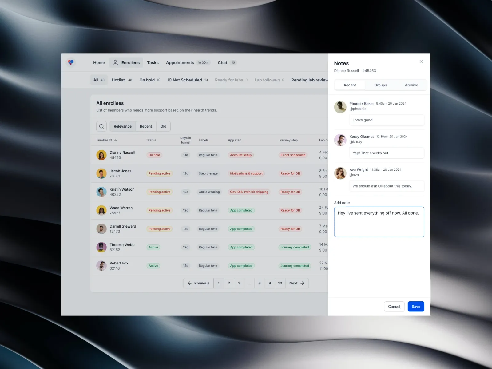
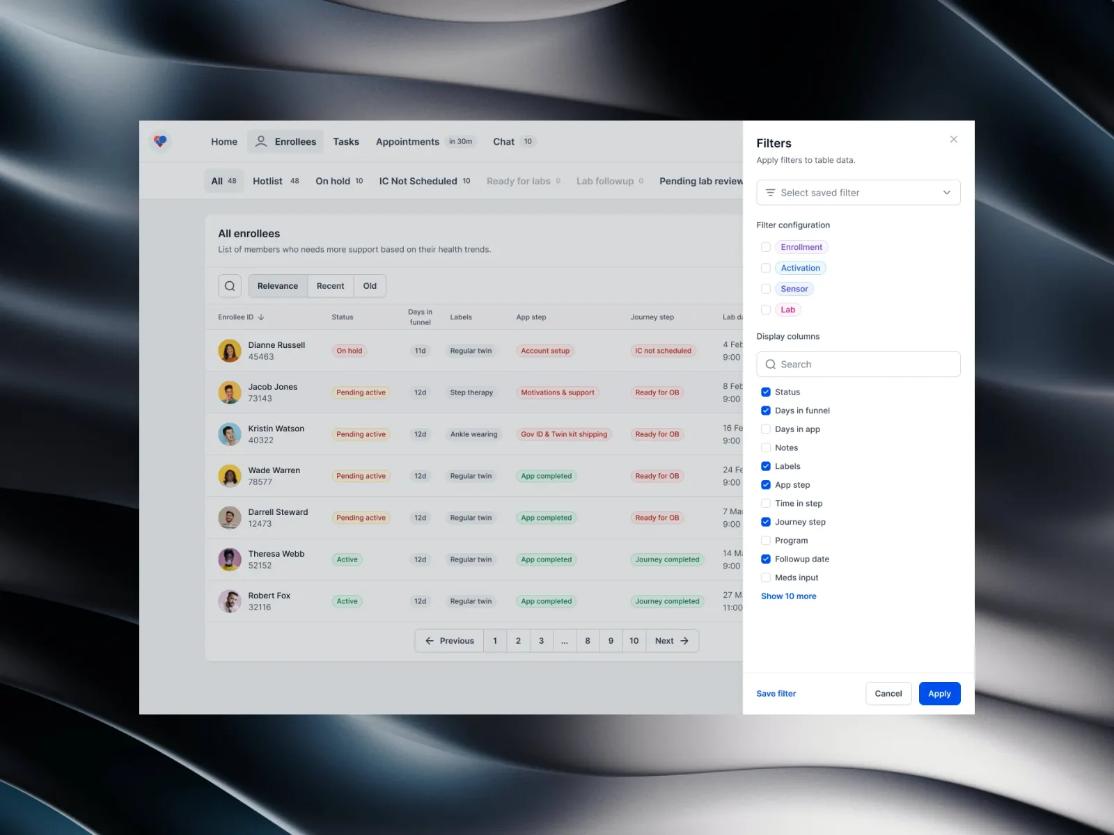
01 / 10The review workspace — The member's day, their care team and the next decision, on one screen.