Health AI SaaS · 07 / 11 · landing page · Mobile
Mobile lead magnet page
A three-question survey behind Twin Health's ads, where every answer changes the proof that follows.
Overview
This is the page behind Twin Health's paid social and search ads — Facebook, Instagram, Google — for people looking for help with Type 2 diabetes, blood pressure or cholesterol. It's a three-question survey that turns a cold click into someone who wants a call back.
The problem: Ads that sent people to the homepage or a long landing page lost most of them at once — bounce rates were often over 75%. Too much text, a menu full of exits, and a request for contact details before giving anything back.
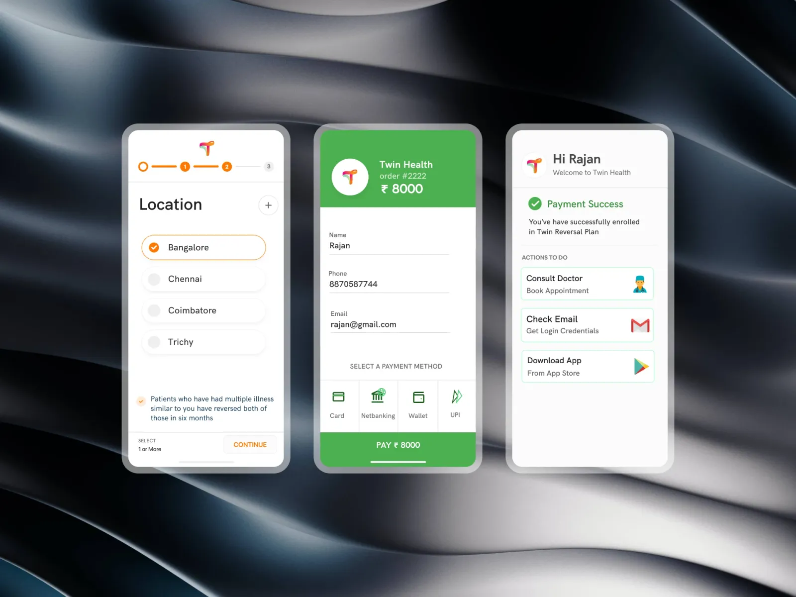
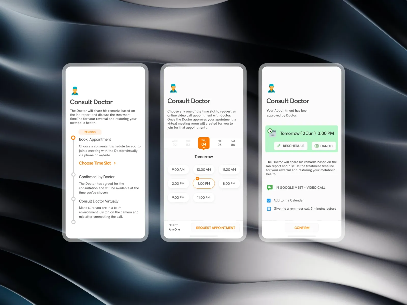
What we built: One decision a screen, and every answer changes what comes next. Pick a goal and the proof shows the numbers that matter for it. Pick an age and a note answers the worry that age brings — "is it too late for me?" — as soon as the button is tapped. The last screen is someone like you, before and after. There's no menu and nowhere to go but forward.
Who it's for:
- Primarily: adults from 35 to over 75 who clicked an ad looking for a way out of diabetes.
- Also: family members looking for an alternative to a lifetime of tablets for a parent.
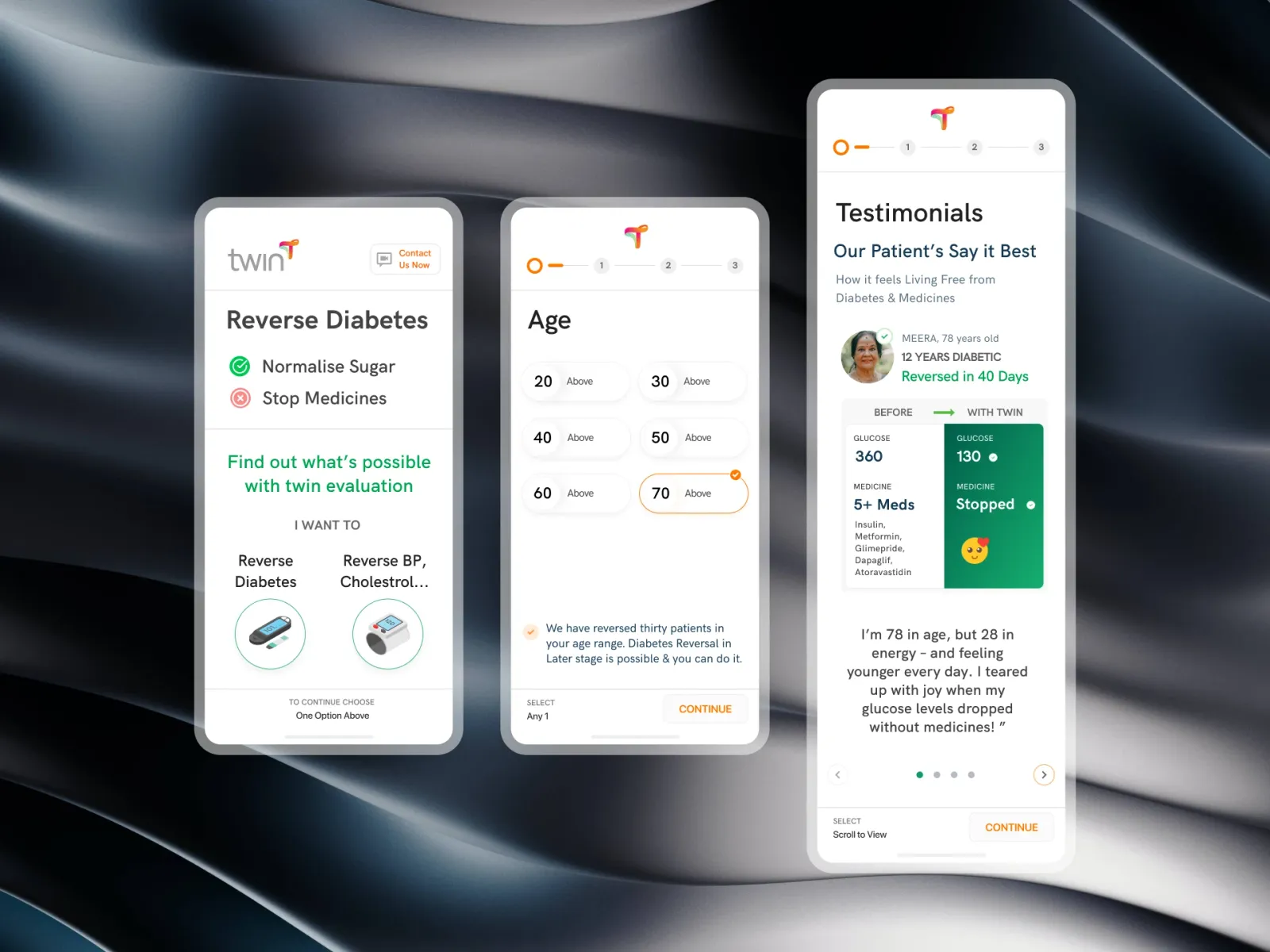
Reverse diabetes: normal sugar, fewer medicines.
To continue, choose oneEvery answer changes the next screen
In the prototype above, change the goal or the age and watch the proof change with it.
What it had to get right:
- No effort to start: the first screen is two pictures. Choosing one is the commitment.
- Personal, at once: the reassurance appears as the age button is tapped, not on the next screen.
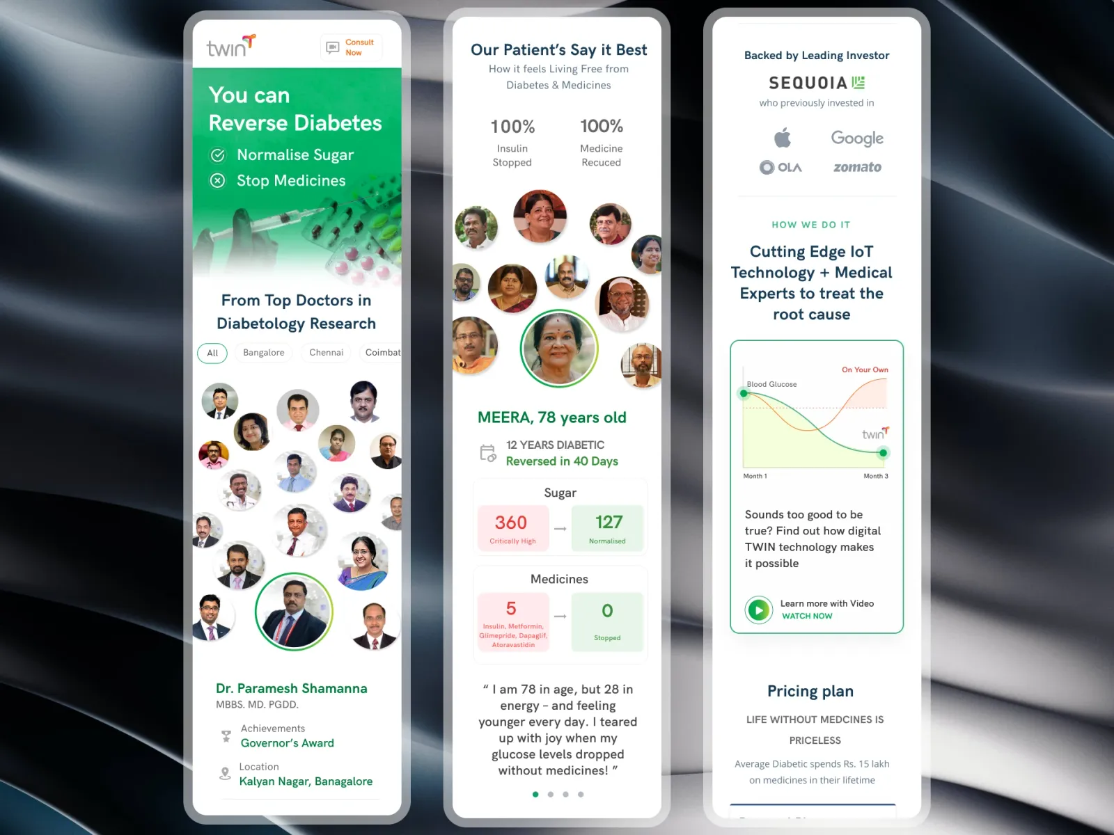
- Believable proof: dropping five medicines to none sounds like a scam unless it's one person, with their age, their years with diabetes and their numbers.
- The thumb: the action bar is fixed at the bottom so no one has to reach or zoom.
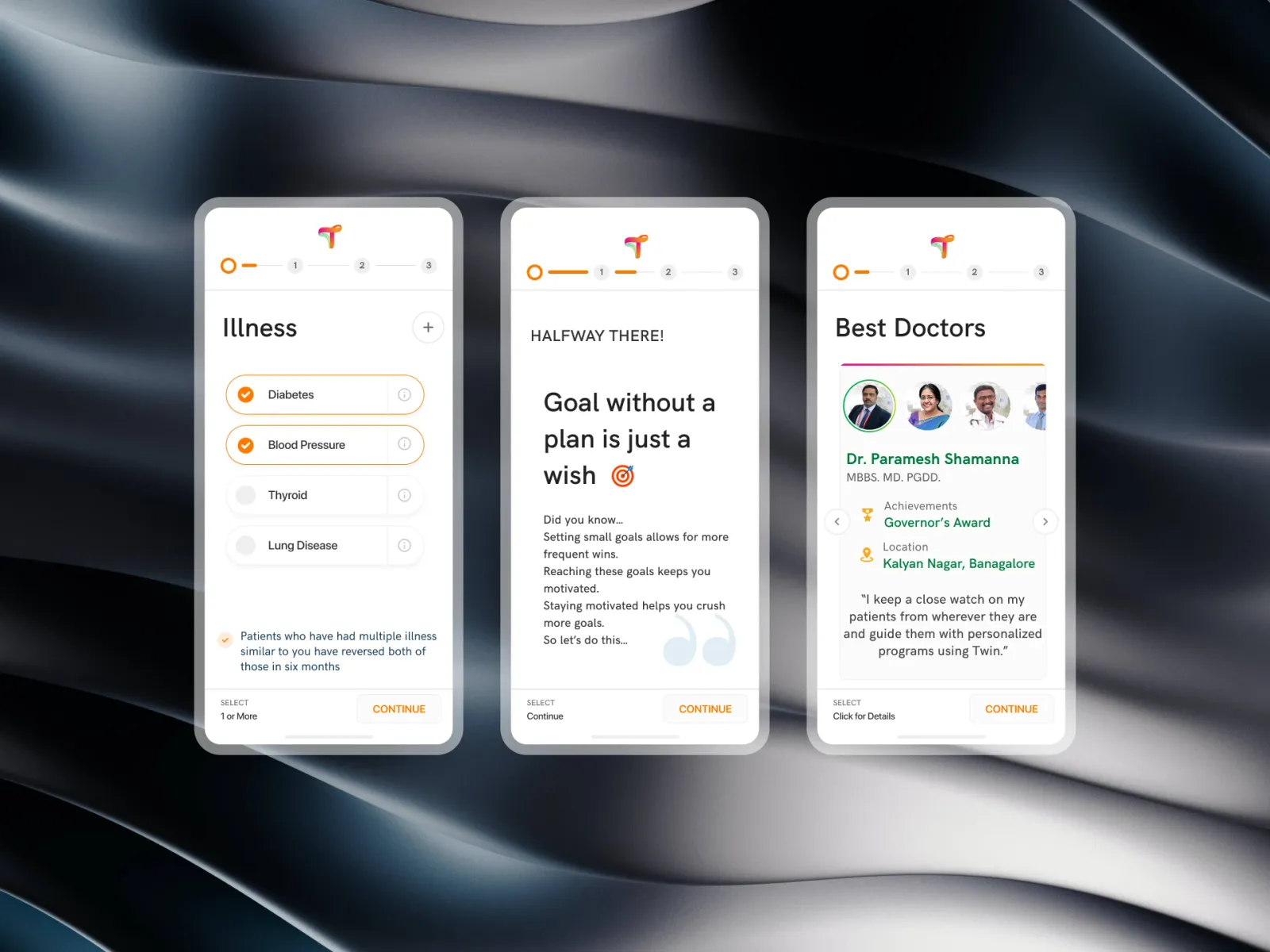
The fork
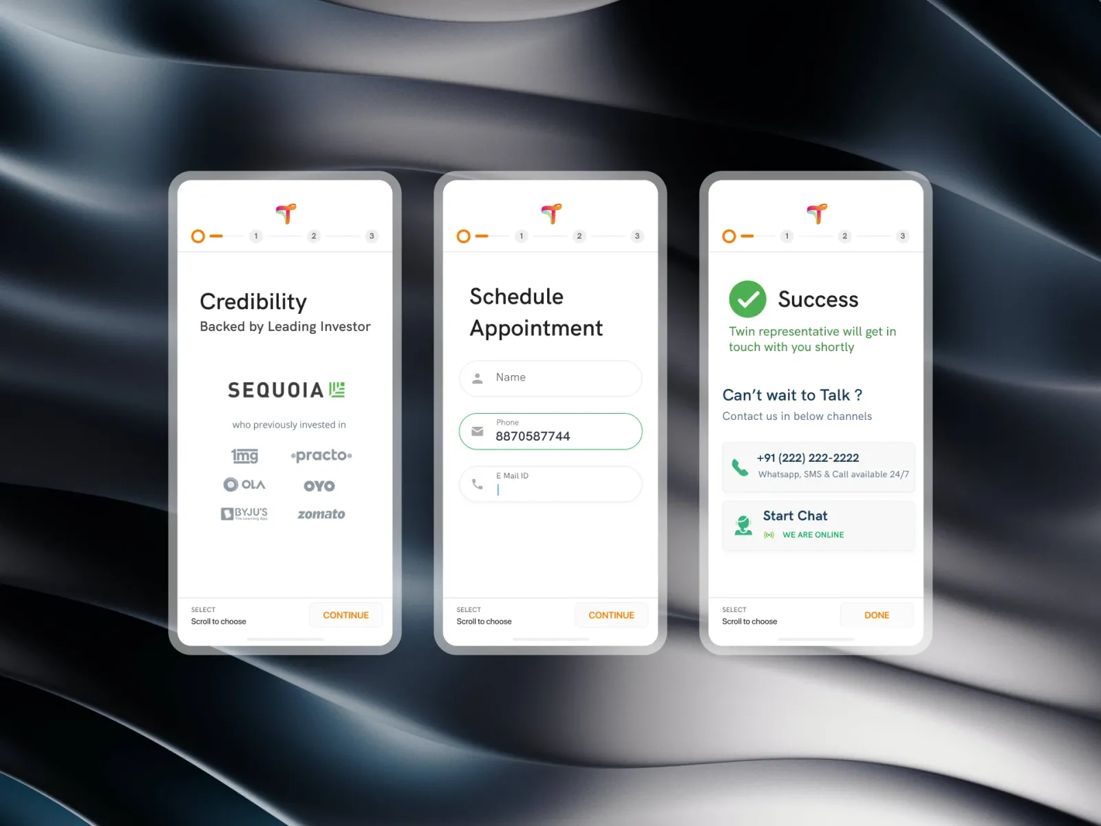
A logo, a call button, one line — "Reverse diabetes: normalise sugar, stop medicines" — and two illustrated cards: Reverse diabetes and Reverse BP, cholesterol. "To continue, choose one option above."
Age
A three-step progress bar and six large buttons, 20 above to 70 above. Choosing 70 above brings up straight away: "We have reversed thirty patients in your age range. Diabetes reversal in later life is possible, and you can do it." It answers the question an older visitor is asking before they ask it.
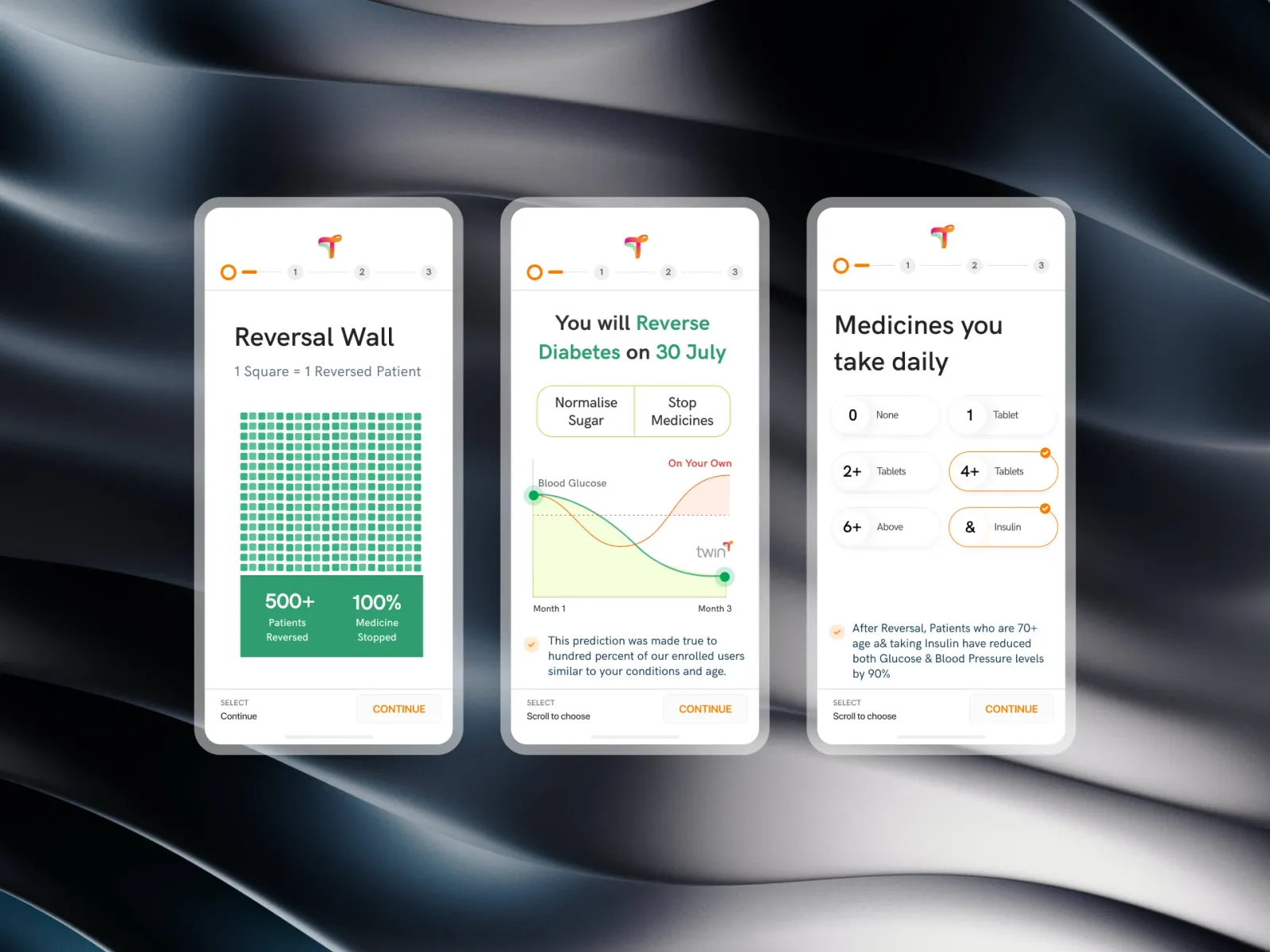
Someone like you
The story is matched to the answers: Meera, 78 · 12 years diabetic · reversed in 40 days, with a photo and a split card — before: glucose 360 and five medicines; with Twin: glucose 130, medicine stopped — and her words: "I'm 78 in age, but 28 in energy." Dots and arrows lead to more stories; Continue stays fixed at the bottom.
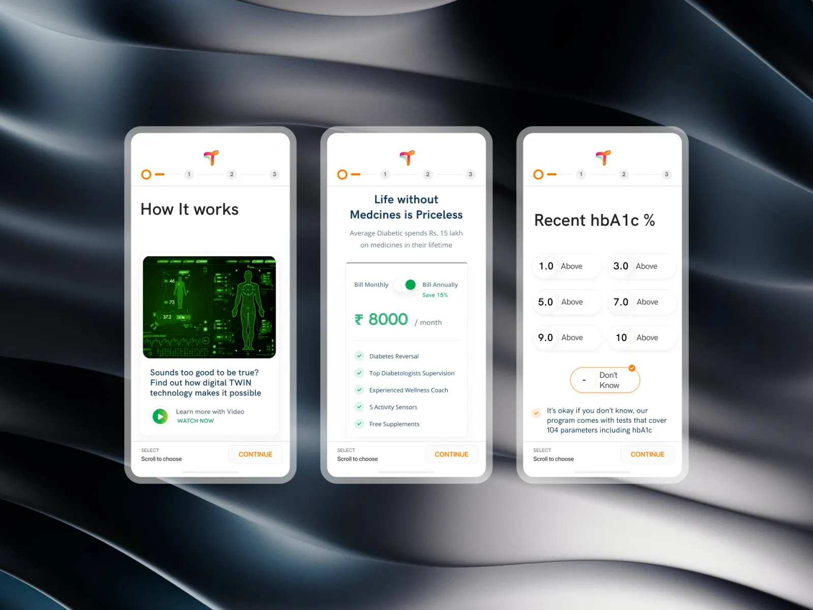
Results
- Visitor to lead: from 11.2% on the standard pages to 15.9%.
- Cost per lead: down by about a quarter in the campaign's first month.
- Show-up: consultations attended rose from 61% to 66% — leads arrived knowing what to expect.
Conclusion
The survey asks three things and gives something back for each. That exchange — a question, then a reassurance or a story that fits — is what turned skeptical ad clicks into people who wanted the call.
Gallery
01 / 13The fork — Two large cards and nothing else to click.