Health AI SaaS · 01 / 11 · mobile application
Mobile onboarding
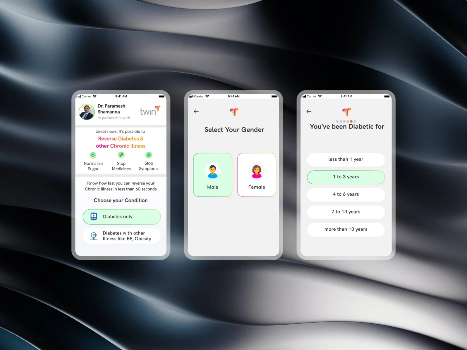
Forty intake questions asked one at a time in three chapters, so new members finish — and their first meal plan looks like their own kitchen.
Overview
This is the intake a new Twin Health member fills in on their phone, before their sensors arrive. It collects what the program needs to build a first meal plan and keep it safe — medicines, allergies, what they won't eat, what a normal day of eating looks like — about forty questions in all.
The problem: The old intake was one long medical form. It was dry, it didn't say how long it was, and its food questions were written for a Western diet. Too many people gave up before their kit shipped, and the ones who finished got first meal plans that didn't look like anything they ate.
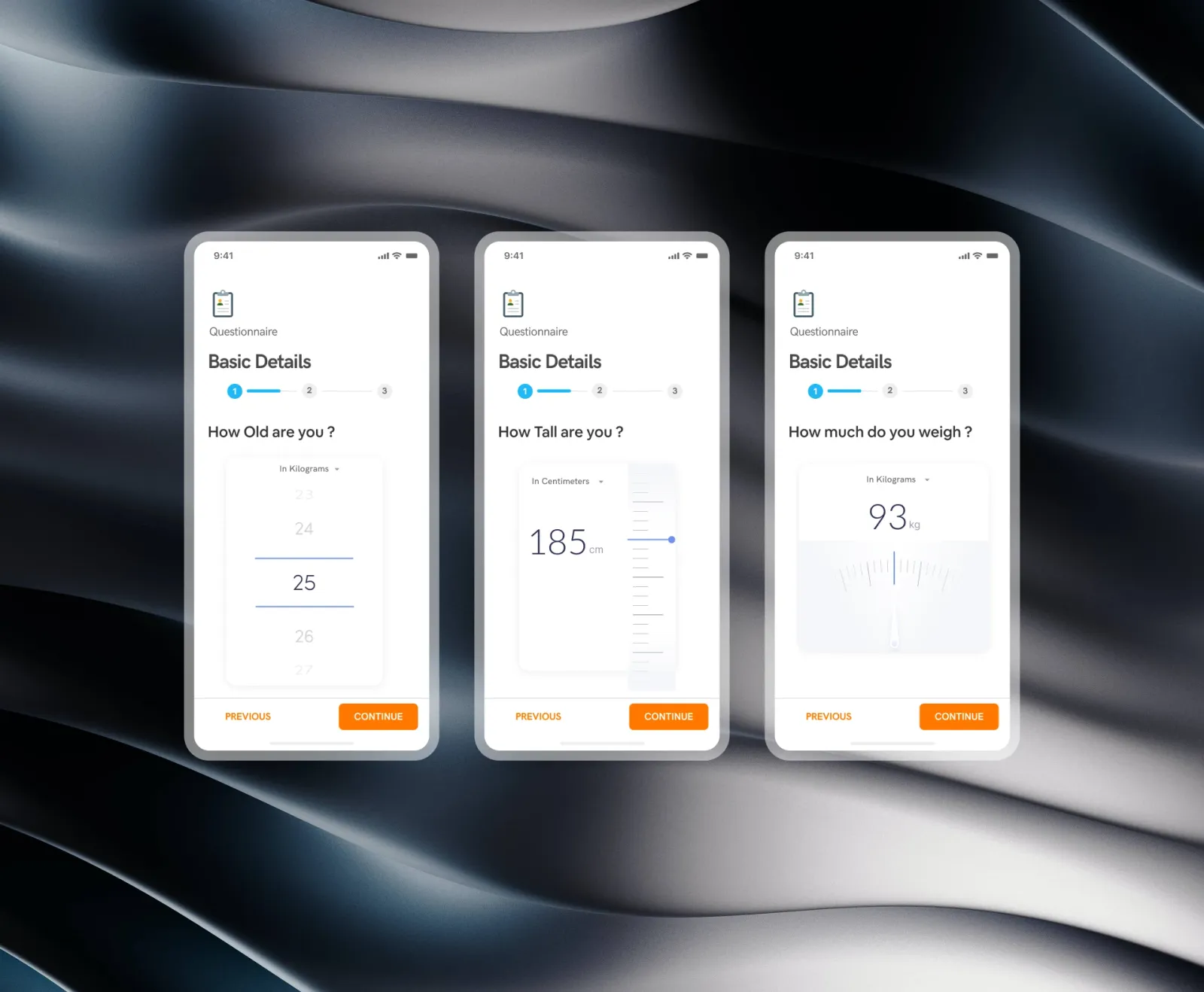
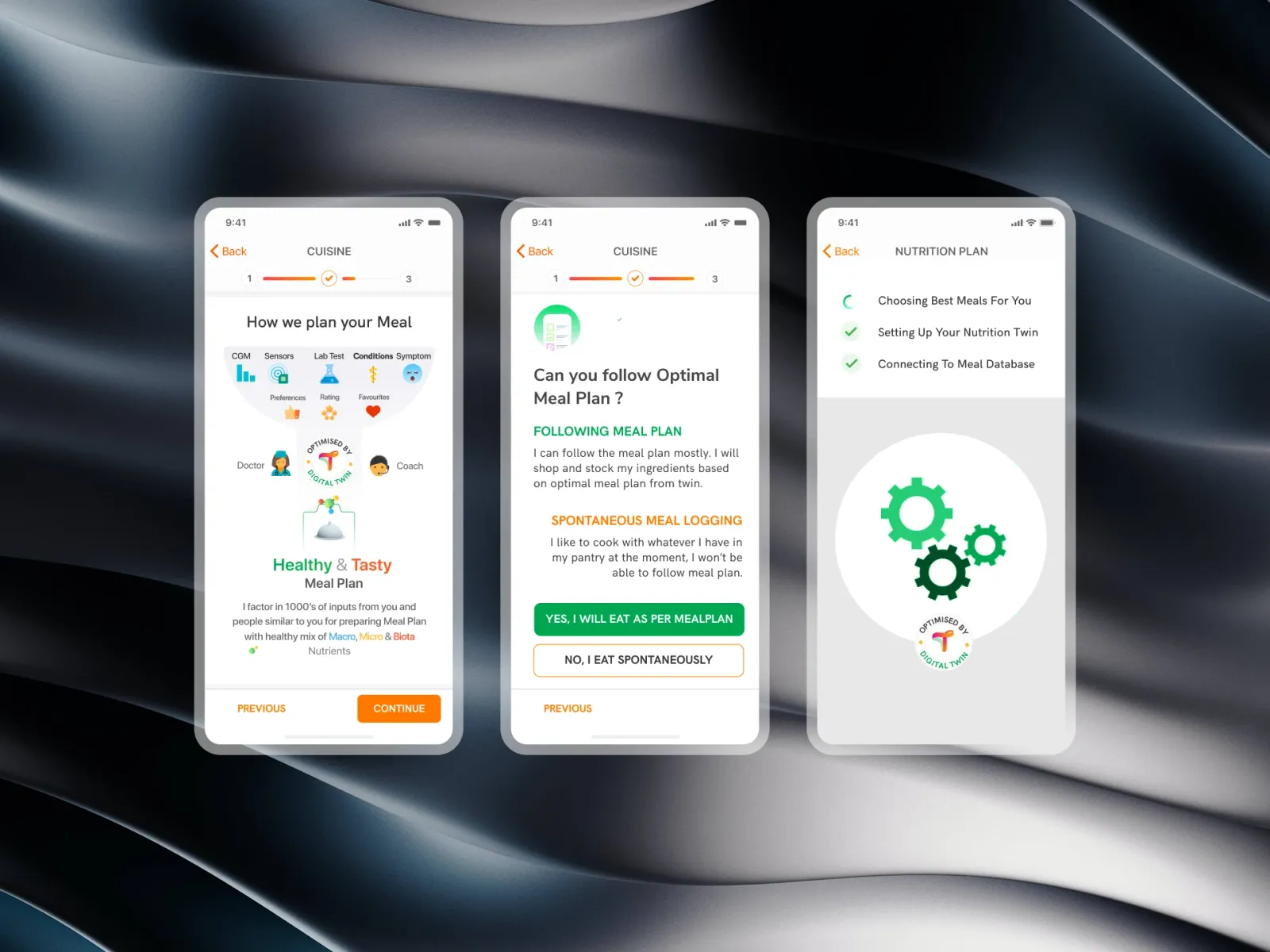
What we built: The same questions, asked one at a time in three chapters — health history, cuisine, your day — with a progress ribbon that only ever counts three. Food is picked from photo tiles, not typed. Allergies and dislikes are separate steps, because they mean different things to the plan. And there's a pause before the last chapter that says how far you've come, by name.
Who it's for:
- Primarily: newly enrolled members with Type 2 diabetes, filling it in at home — many of them older, some with diabetic eye disease.
- Also: the care coordinators and onboarding specialists who read the finished profile.
Which medicines do you take today?
Pick all that apply. Your doctor checks this before anything changes.
How the intake is put together
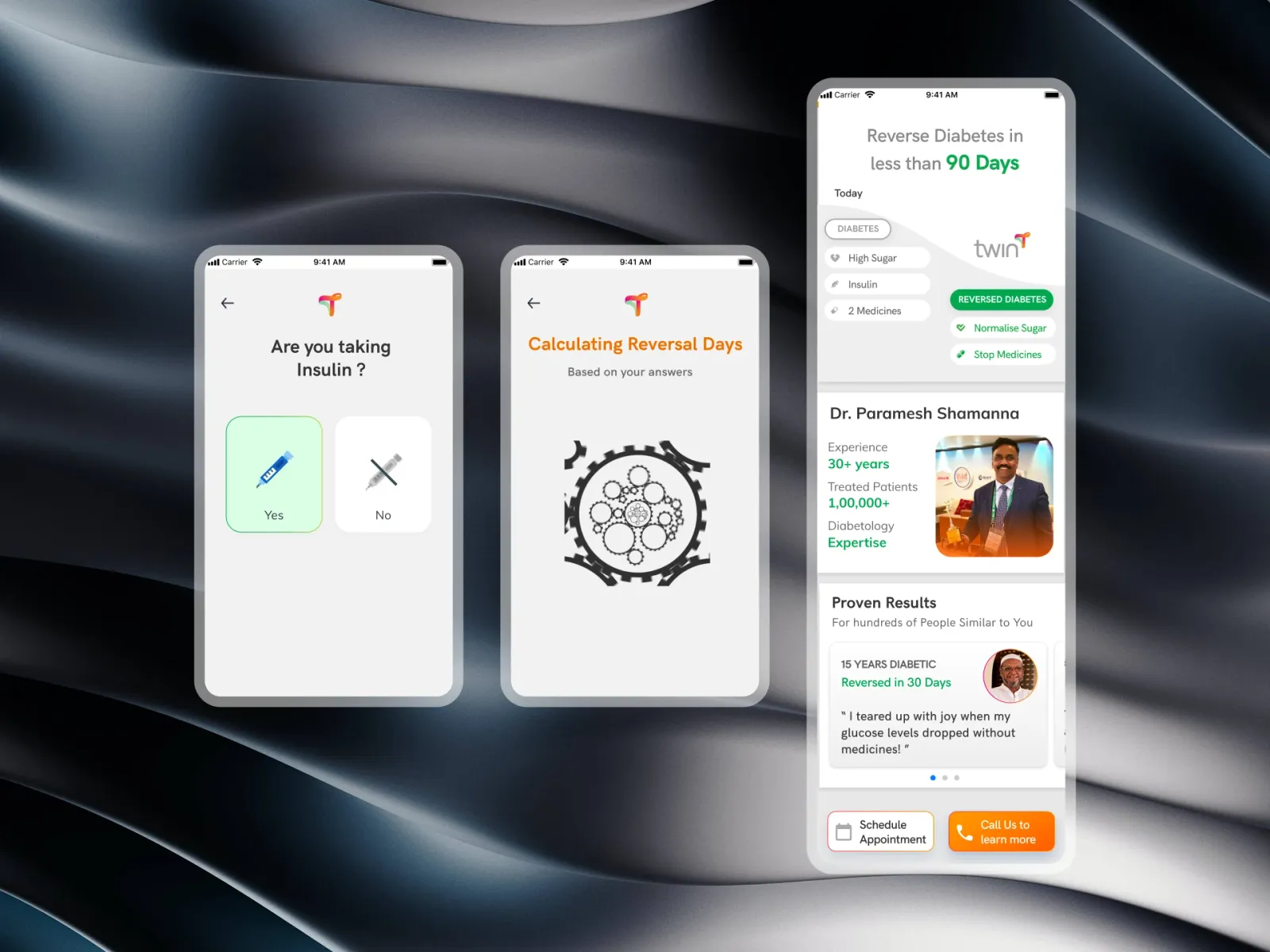
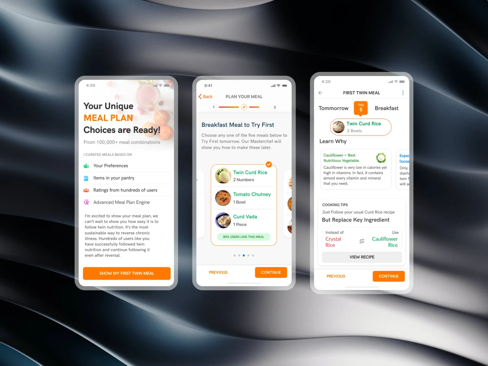
The prototype above is the intake end to end. Its last screen is built from your answers — the brief the meal planner gets — so you can see that every tap went somewhere.
The design rests on four decisions:
- One question a screen. Forty questions on one page is a wall. Forty screens with a ribbon that counts three chapters is a short walk.
- Say why. Every question has one line under it saying what the answer changes — "Your doctor checks this before anything changes."
- Allergy is not dislike. An allergy is never in a plan. A dislike is left out because a plan you skip doesn't help anyone. Asking them on the same screen blurred the two.
- Show where answers went. The intake ends on a summary of what the plan will and won't use, which is what makes the effort feel worth it.
Designing for the people filling it in
The tension was clinical depth against consumer patience. We needed sensitive, detailed answers from people who didn't have to give them.
- Form fatigue: forty data points, without it feeling like forty.
- Allergy accuracy: serious allergies (gluten, peanuts, shellfish) declared clearly, and kept apart from taste.
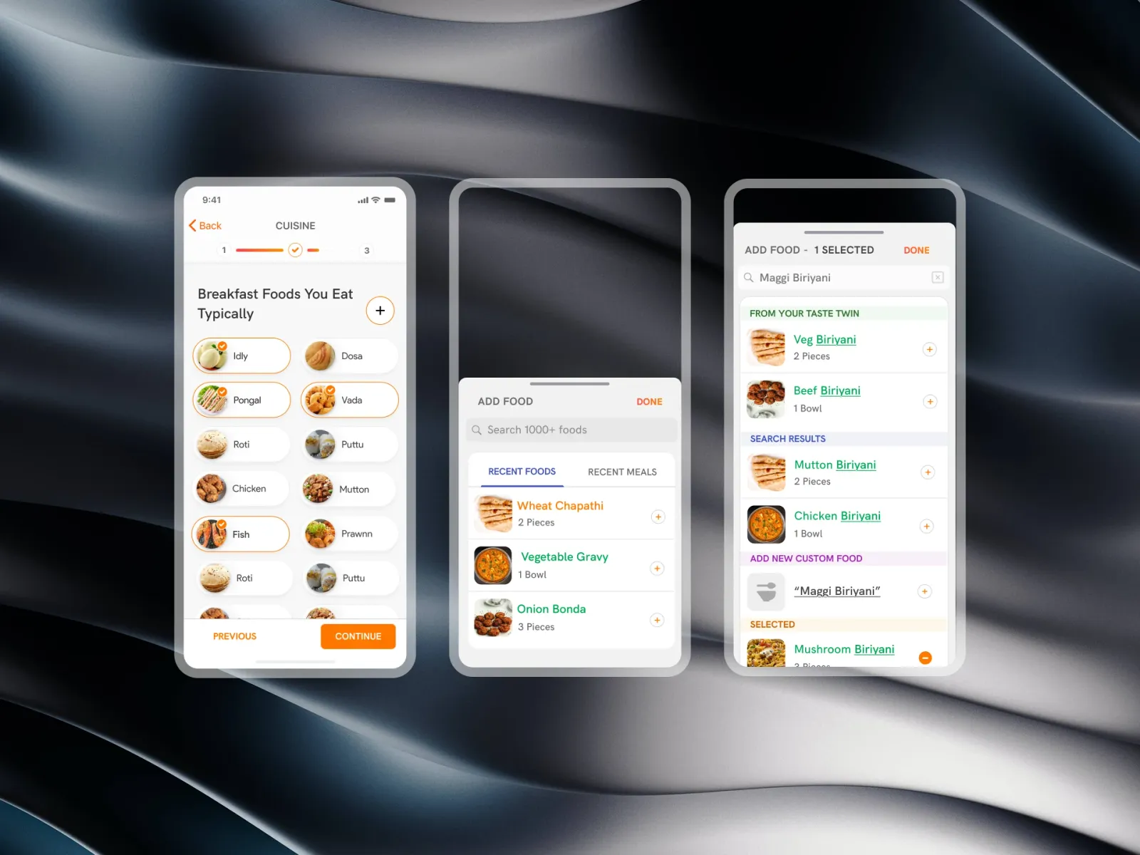
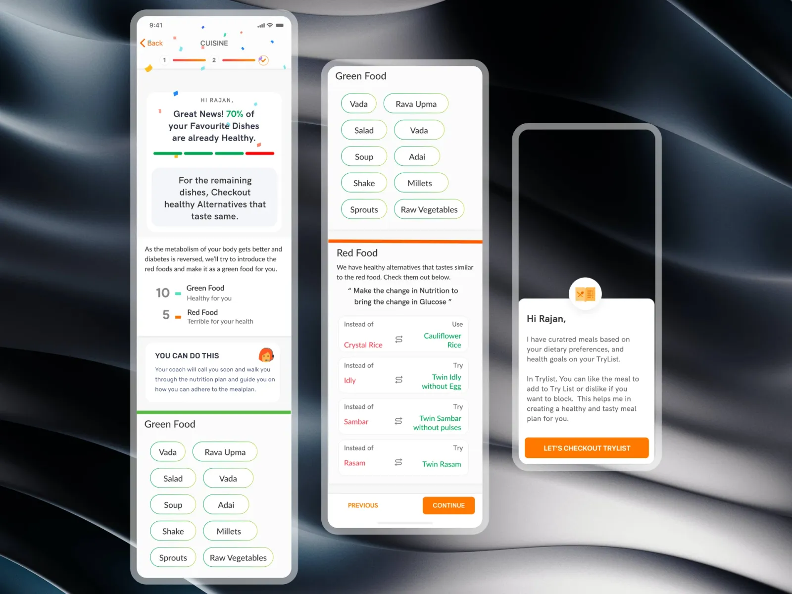
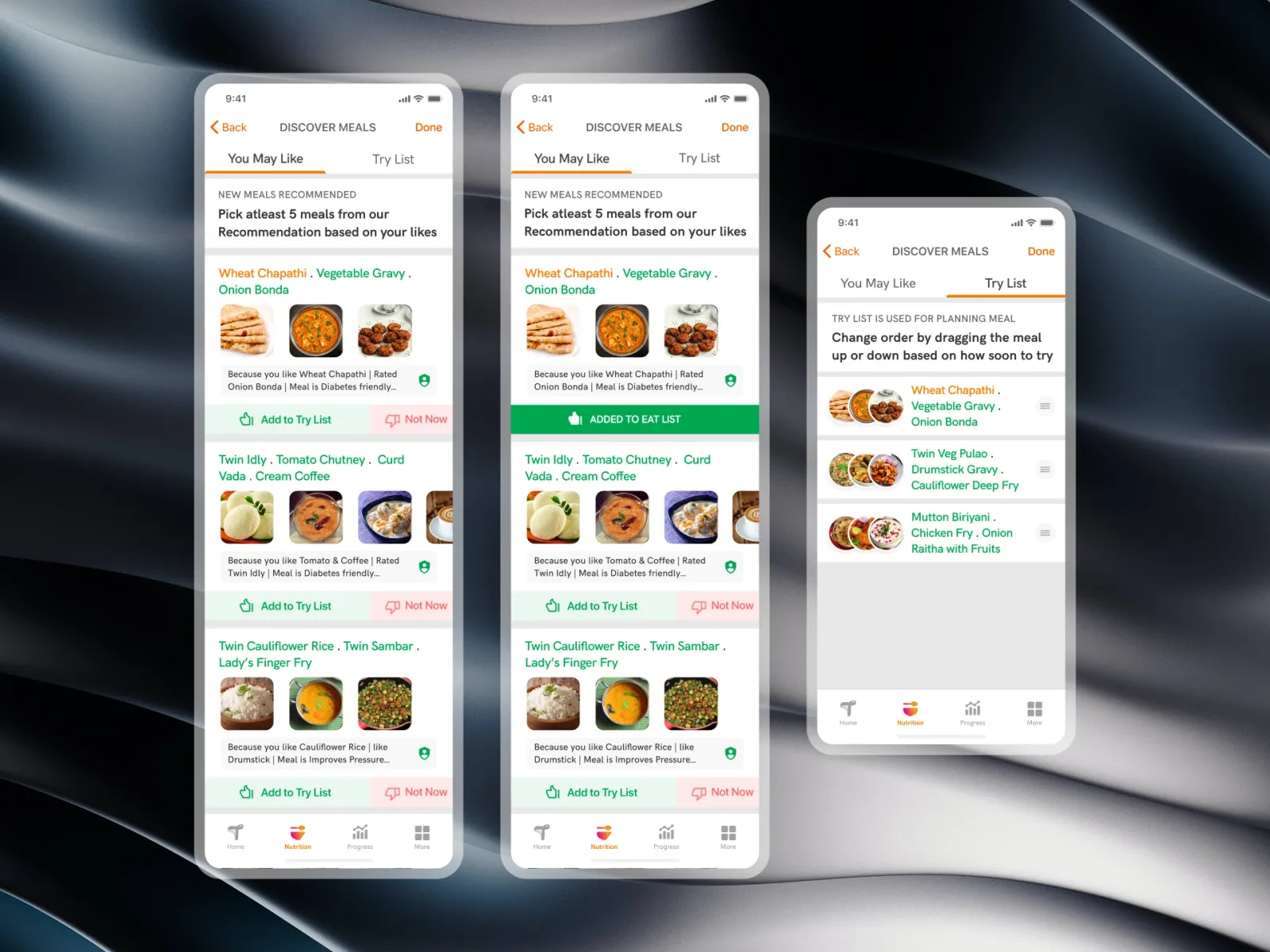
- Regional food: South Asian and Western staples side by side, so the first plan is recognisable.
- Ergonomics: large type and targets for older members, some of whom have diabetic retinopathy or less steady hands.
Allergies
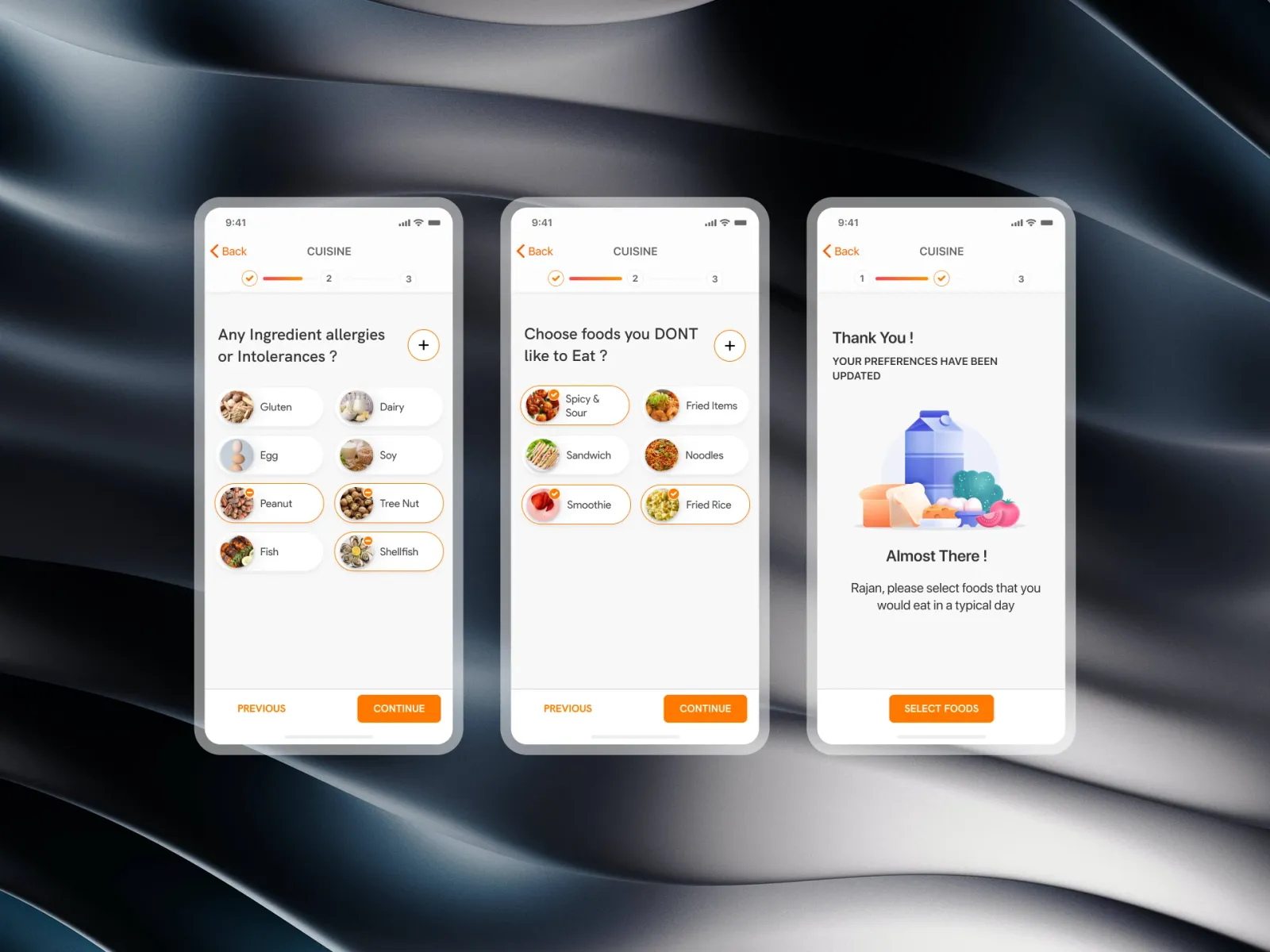
Allergens are photo tiles — gluten, dairy, egg, soy, peanut, tree nut, fish, shellfish — because a picture is recognised before a word is read. A picked tile gets a strong outline and a mark, not just a tint, so there's no doubt about what's excluded. A small "+" adds anything rare without a ninth tile for everyone.
Dislikes
A separate step, worded plainly: "Choose foods you don't like to eat" — spicy and sour, fried items, sandwiches, noodles, smoothies, fried rice. Whatever is picked here is left out of the first plan, which matters more for whether people stick to it than almost anything else we ask.
The milestone
Before the last chapter, a pause: a grocery basket illustration and "Almost there, Rajan — please select foods you would eat in a typical day." Using the member's first name sets the tone of the coaching relationship that follows.
Where the thumb goes
- Continue is full width at the bottom, and the only filled control on the screen.
- Back is always available at the top and on a secondary Previous, and never submits anything.
Results
- Drop-off during intake: from 39% to 27%.
- Median time to finish: from about six minutes to about four.
- First meal plan: about three in four members said it matched their tastes, and requests to change it in the first week fell.
Conclusion
Nothing here made the questions fewer. Asking them one at a time, saying why, and showing where the answers went made the same forty questions feel like a conversation — and the plan that came out of it looked like the member's own kitchen.
Gallery
01 / 17Progress ribbon — Three chapters, the current one lit, and the chapter's name above the question.