Health AI SaaS · 05 / 11 · mobile application
Doctor mobile app
The doctor's phone companion: a queue to clear between rounds, and a safe way to change a dose the hour it should change.
Overview
The doctor workspace is for full reviews at a desk. This is its phone companion, for the endocrinologists who spend their day on rounds, in transit or on call — so that a dose can be changed the hour it should be, not the next time they're at a desktop.
The problem: On the program, members' blood sugar can fall quickly as their habits change. If their medicine isn't reduced in time, a falling glucose becomes a dangerous low. The hospital record had no usable mobile view, so doctors waited until they were back at a terminal — often the next morning.
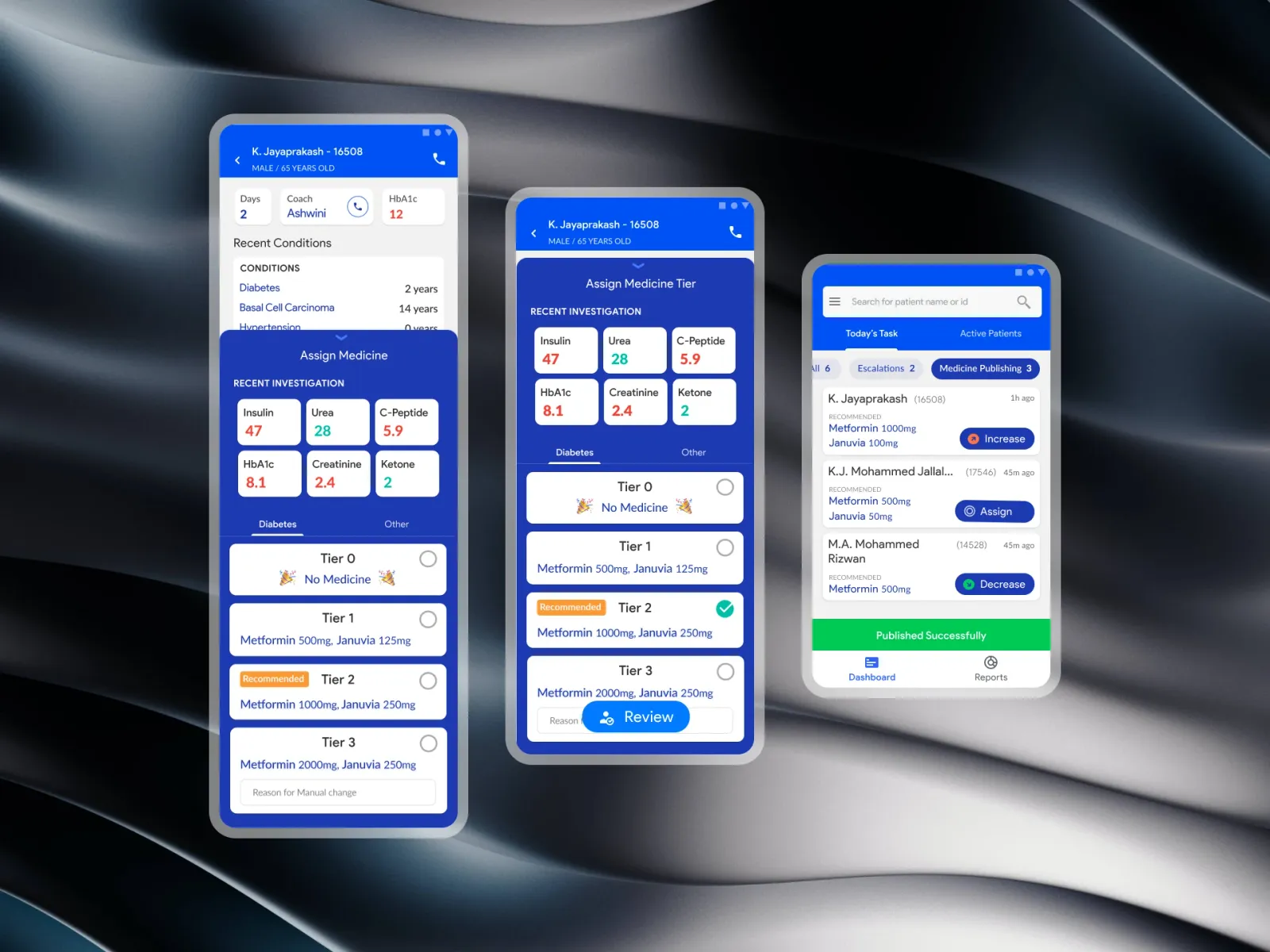
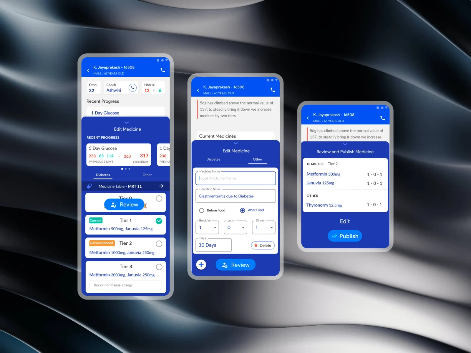
What we built: A task queue a doctor can clear between rounds. Each card says who, what the system suggests and which way the dose goes. The patient's screen shows the six labs that decide it. A bottom sheet turns the prescription into one of four standard tiers. Taking the recommended tier is one tap; taking another asks why. And the publish button names the patient and the tier.
Who it's for:
- Primarily: endocrinologists, diabetologists and consulting physicians with large member panels.
- Also: clinical pharmacists and care coordinators who check each change.
Tasks
From an alert to a new dose
The prototype above is the queue. Open a task, choose a tier other than the recommended one, and see what Publish asks for.
Speed and safety pull against each other on a phone, so the design picks its moments:
- Fast where it's safe: the recommended tier is one tap, because the reasoning behind it is on the screen.
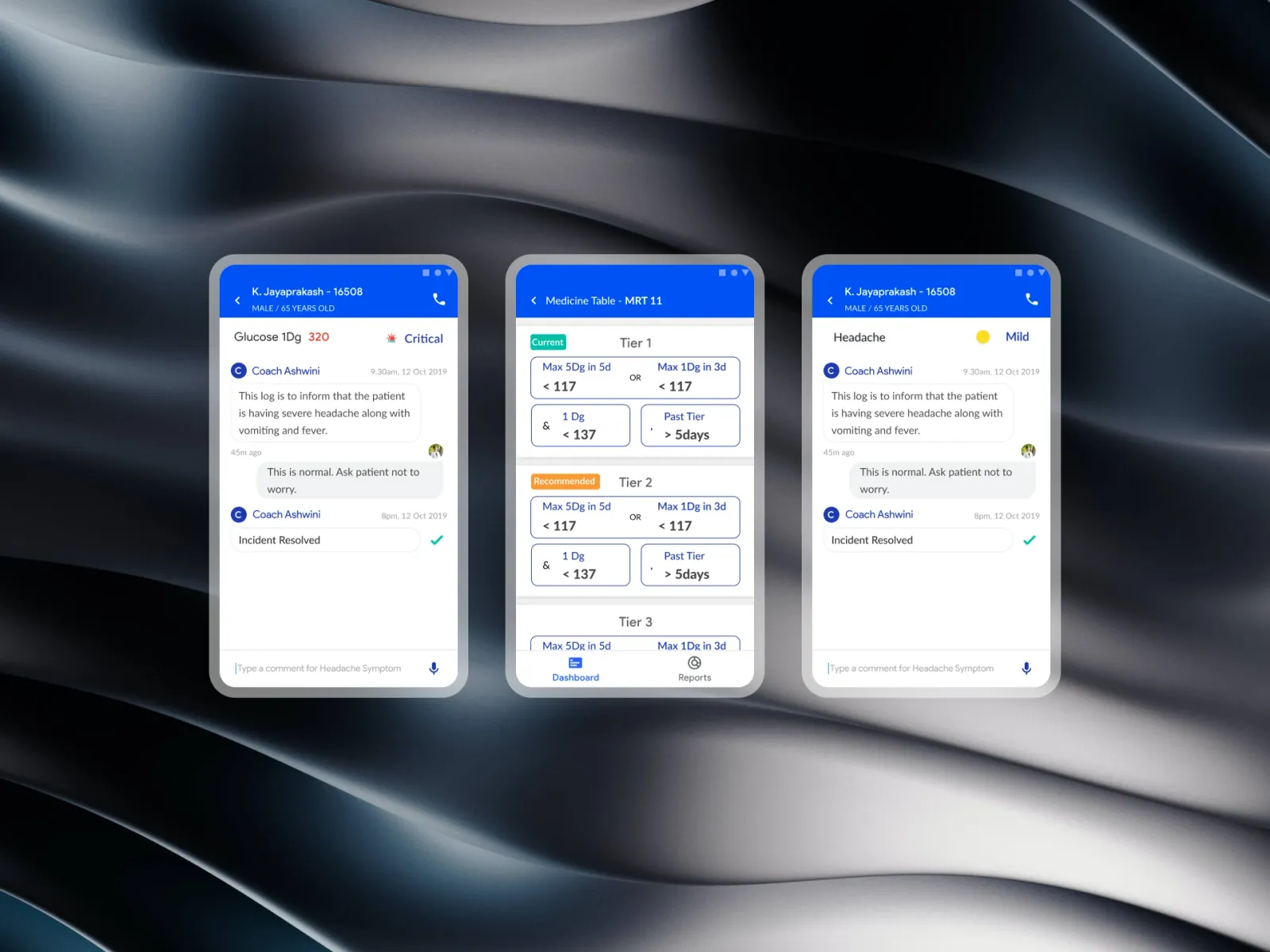
- Slow where it matters: overriding it asks for a short reason, which is kept with the change.
- Read last, read always: Publish says Tier 2 · Jayaprakash, so the last thing a doctor reads before a dose changes is whose and what.
The queue
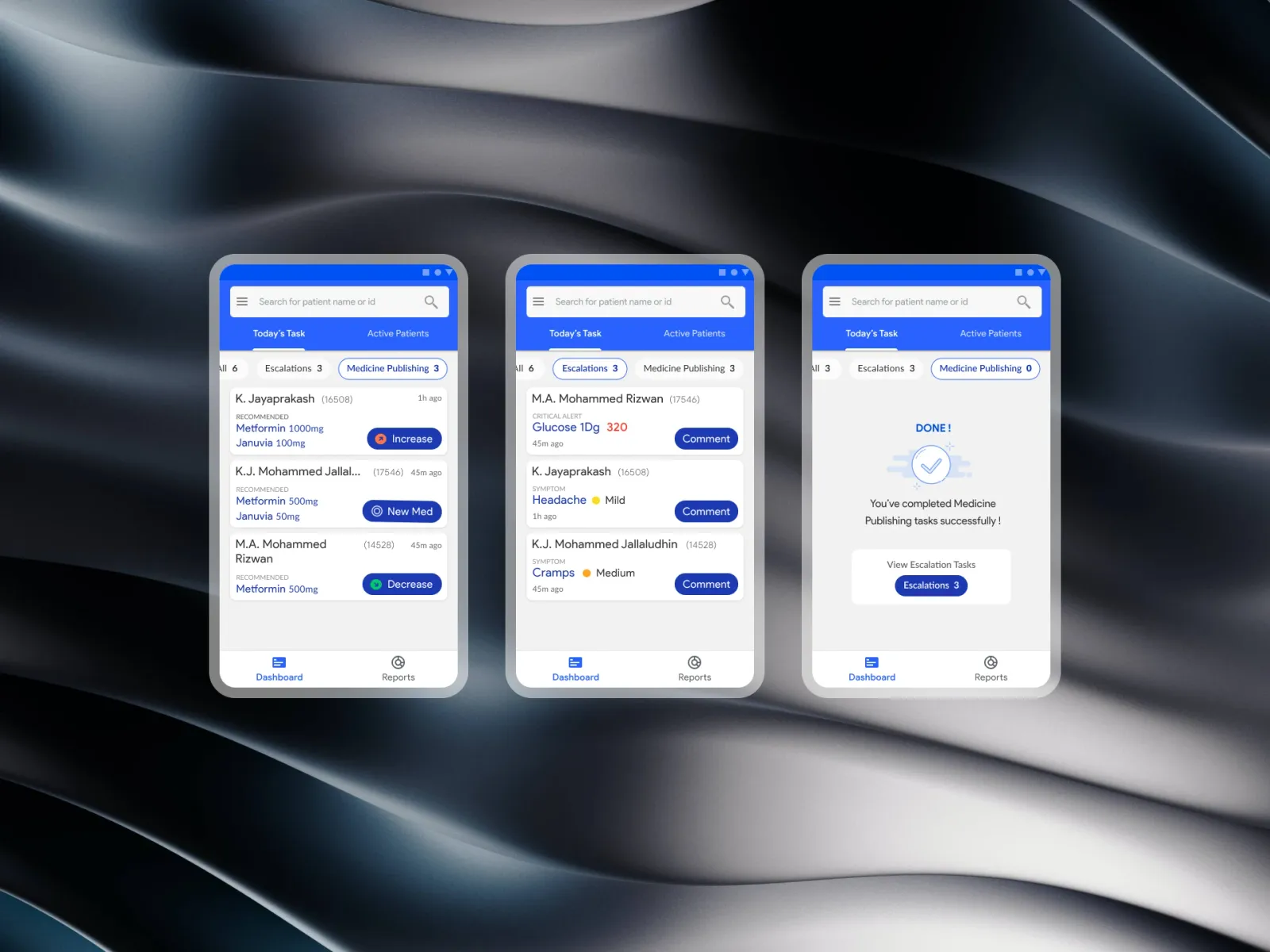
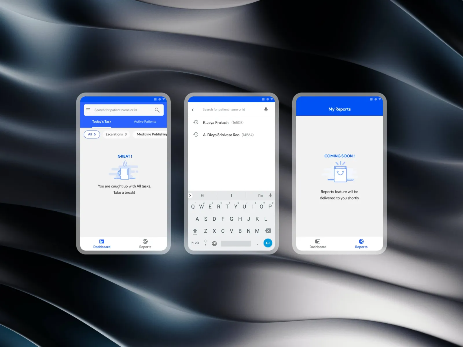
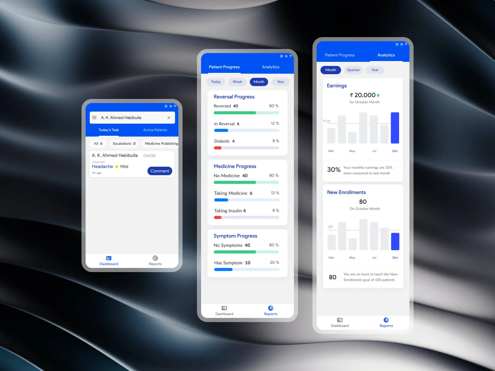
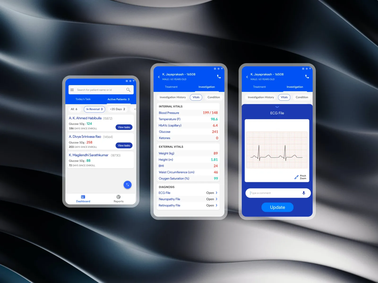
The home screen is an inbox with three filters — All, Escalations, To publish — and a search for name or ID. Each card has the patient, the time since the alert, the current medicine and a pill with the direction of the suggestion: Increase, Assign or Decrease, with an arrow, so the direction never depends on a colour.
The patient
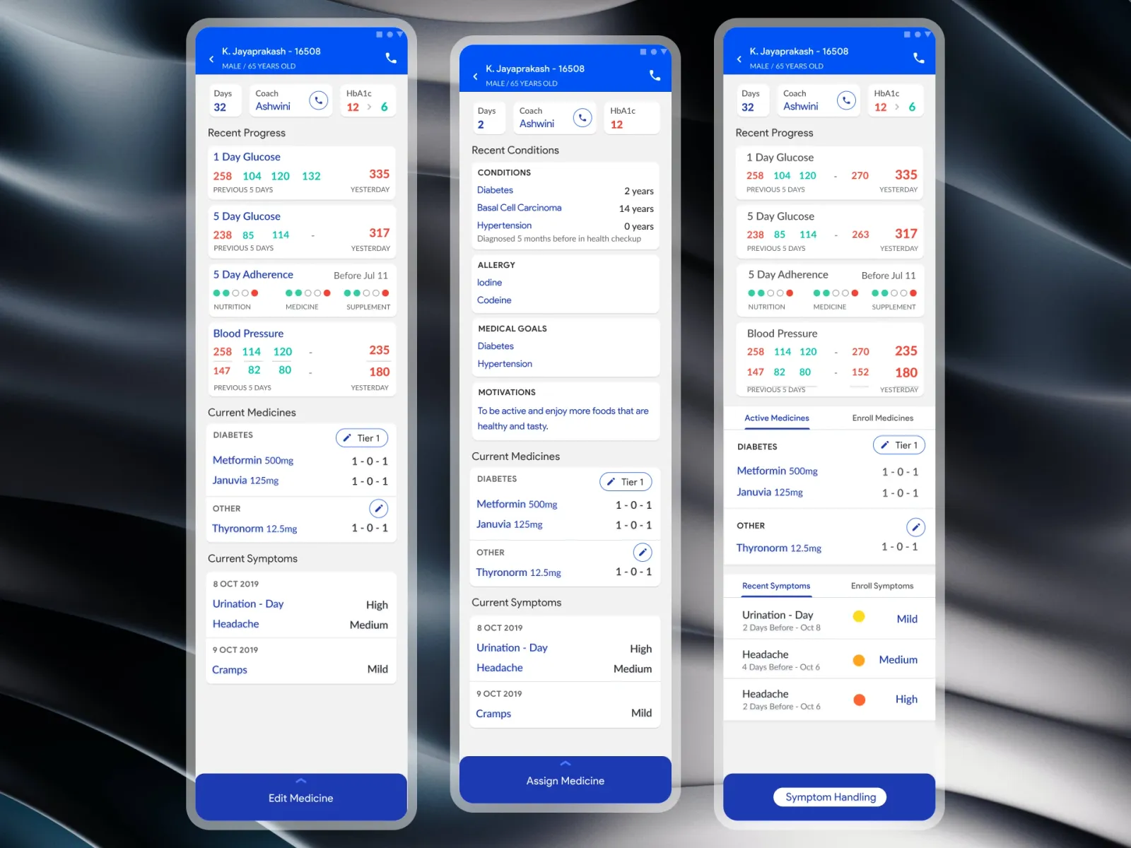
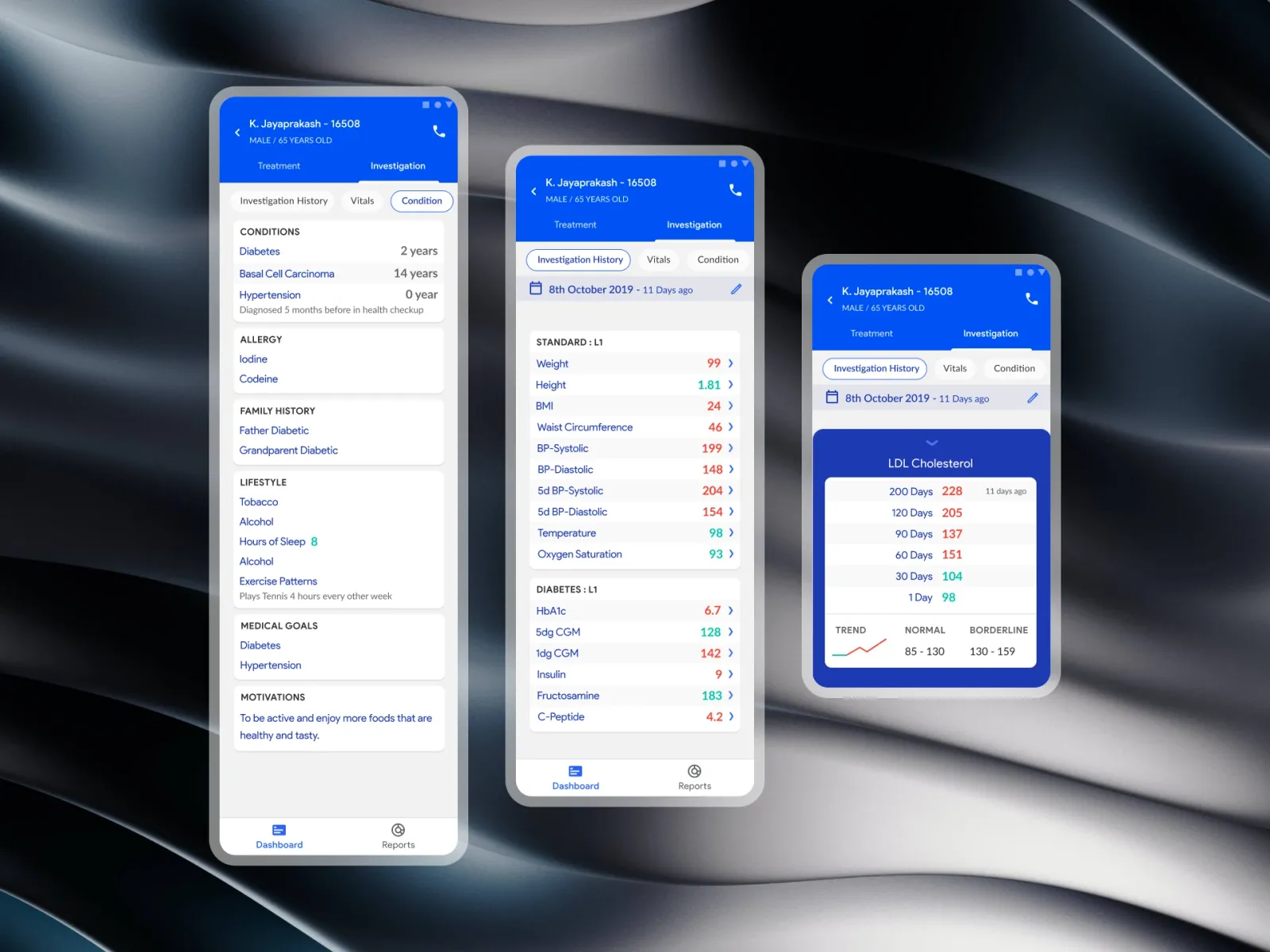
Tapping a card opens a summary: name, ID, age, day on the program, latest HbA1c, the long-running conditions, and the member's coach with a button to call them.
Six labs
Before any change, six numbers in a grid — insulin, urea, C-peptide, HbA1c, creatinine and ketones. Abnormal values are knocked out in solid ink, so a kidney value that should hold a dose down can't be missed.
The tier sheet
- Tier 0 — no medicine. The goal of the program, at the top of the list.
- Tiers 1 to 3 — standard combinations of Metformin and Januvia, from a low maintenance dose to the ceiling.
- Recommended — labelled in words on one tier, selectable in one tap.
- A reason — required whenever the choice isn't the recommendation, and stored in the audit trail.
Published
A confirmation — Published successfully — and the change goes out to the pharmacy and the member's app at once, with the doctor, the tier and the reason on record.
Results
- Alert to dose change: from an average of 18 hours to 22 minutes.
- Safety: severe low-glucose events in the pilot group fell by about a quarter over three months.
- Where doctors used it: 9 of the 12 pilot doctors preferred the phone for routine checks, and still opened the desktop for full reviews.
Conclusion
The phone didn't replace the desk. It took the one decision that couldn't wait — a dose that should come down today — and made it safe to take standing up: one tap when the evidence agrees, a reason when it doesn't, and the patient's name on the button.
Gallery
01 / 10The queue — Search, filters for escalations and medicines to publish, and a direction on every card.