Behavior Loop · 05 / 05 · growth & acquisition · ux research · Web
Enrollment Funnel Architecture
Checking eligibility on the web before asking anyone to install the app — which lifted employer enrollment by about half.
- Enrolled
- 8.2% → 12.9%
- Lost at eligibility
- 78% → 52%
- Time to sign up
- 15 → 7 min
- Test size
- 12,400 employees
Overview
This is how Twin Health enrolls people through their employers and health plans. Self-insured employers, commercial plans and health systems each bring their own channels, rules and populations, and an eligible employee has to get from an HR email or a postcard to an active member on the program. This work covers the campaign taxonomy that tracks every invitation, the web-first sign-up that replaced an app-first one, and the lead journey for partners who sell by consultation.
The problem: People who got an employer email or a benefits mailer were sent straight to the App Store and asked to install the app before they knew whether they were even eligible. More than 70% of them never got through.
What we built: Eligibility before installation. Invitations open a short web flow — check eligibility with an employer and insurance ID, take a short quiz, see that it costs nothing — and only then does a one-time link carry the person into the app, with everything they entered already there. Behind it, a campaign taxonomy so every enrollment can be traced to the invitation that produced it.
Who it's for:
- Primarily: employees and dependents with Type 2 diabetes whose employer sponsors the program in full.
- Also: growth marketers, enterprise account executives and acquisition designers.
Opened the invite
Confirmed eligibleWhere they part
Finished the quiz
Enrolled
52%
was 78%
7 min
was 15 min
$86
was $122
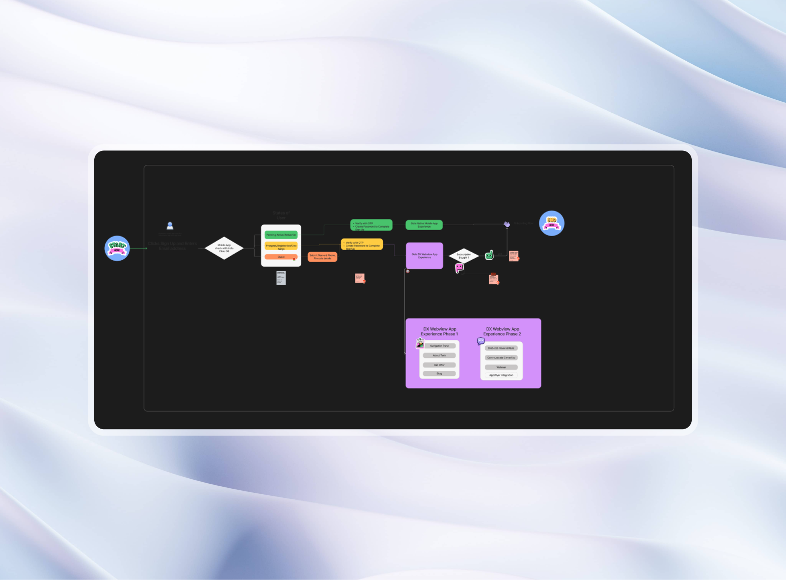
- GuestWeb, no install
- ProspectEligible + quiz
- Pending activeSMS one-time link
- ActiveApp, profile carried over
Eligibility before any install; the app opens already knowing who you are.
The funnel, as a model
The model above runs both flows on the test's own rates. Drag the number of employees invited and watch where the two part; pick a flow to see the states a person moves through.
What made it hard:
- Many channels. Postcards, flyers, table tents, intranet portals, HR newsletters, SMS and on-site health fairs — each needing attribution.
- Eligibility without a form. Checking coverage across different plans without a long, frightening enrollment form.
- Web to app, without starting again. Moving someone from a browser into a secure native app without losing their session or making them sign in twice.
The campaign taxonomy
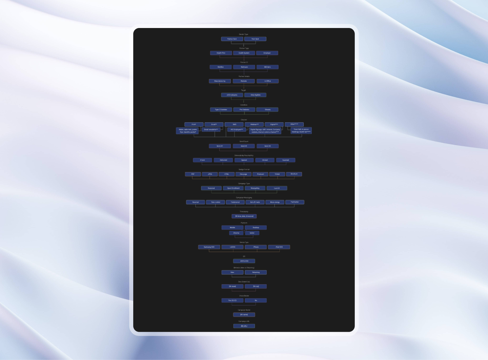
Every invitation is tagged on fifteen fields, grouped like this:
- Sender and partner: sent by the partner or by Twin; health plan, health system or self-insured employer.
- Channel: print (mailers, flyers, table tents), email (HR newsletters), SMS, webinars, digital signage (ADP portals, intranets).
- Delivery: sent, delivered, opened, clicked, scanned.
- Format and message: one-page PDF, tri-fold, retargeting ad; and the hook — reversal, take control, get off medications, more energy, member stories.
- Device: platform, model, OS and location, so the landing page fits the screen it's opened on.
Web first, then the app
On the web, nothing to install
From an email link or a QR code, a person lands in a short web flow:
- Eligibility: employer name and insurance ID, checked in the background.
- A quiz: a short, interactive explanation of how the digital twin works.
- The offer: fully sponsored by the employer — $0 to the member.
Then the app
Once they're eligible and decide to join, an SMS brings a single-use link. When the app opens, it already has everything they entered; their state moves from Prospect to Pending active without signing in again.
The lead journey
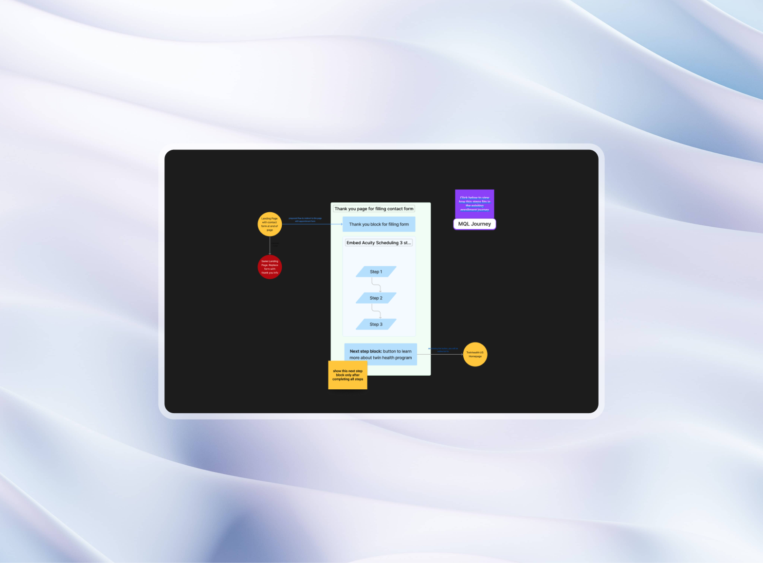
For partners who enroll through a consultation:
- A short form: the essentials and a good time to call.
- Booking in place: an Acuity scheduler embedded in the thank-you page, not a redirect — most people picked a time in under 30 seconds.
- While they wait: the confirmation shows member stories and what to expect, so the momentum isn't lost before the call.
A/B test: app first vs. web first
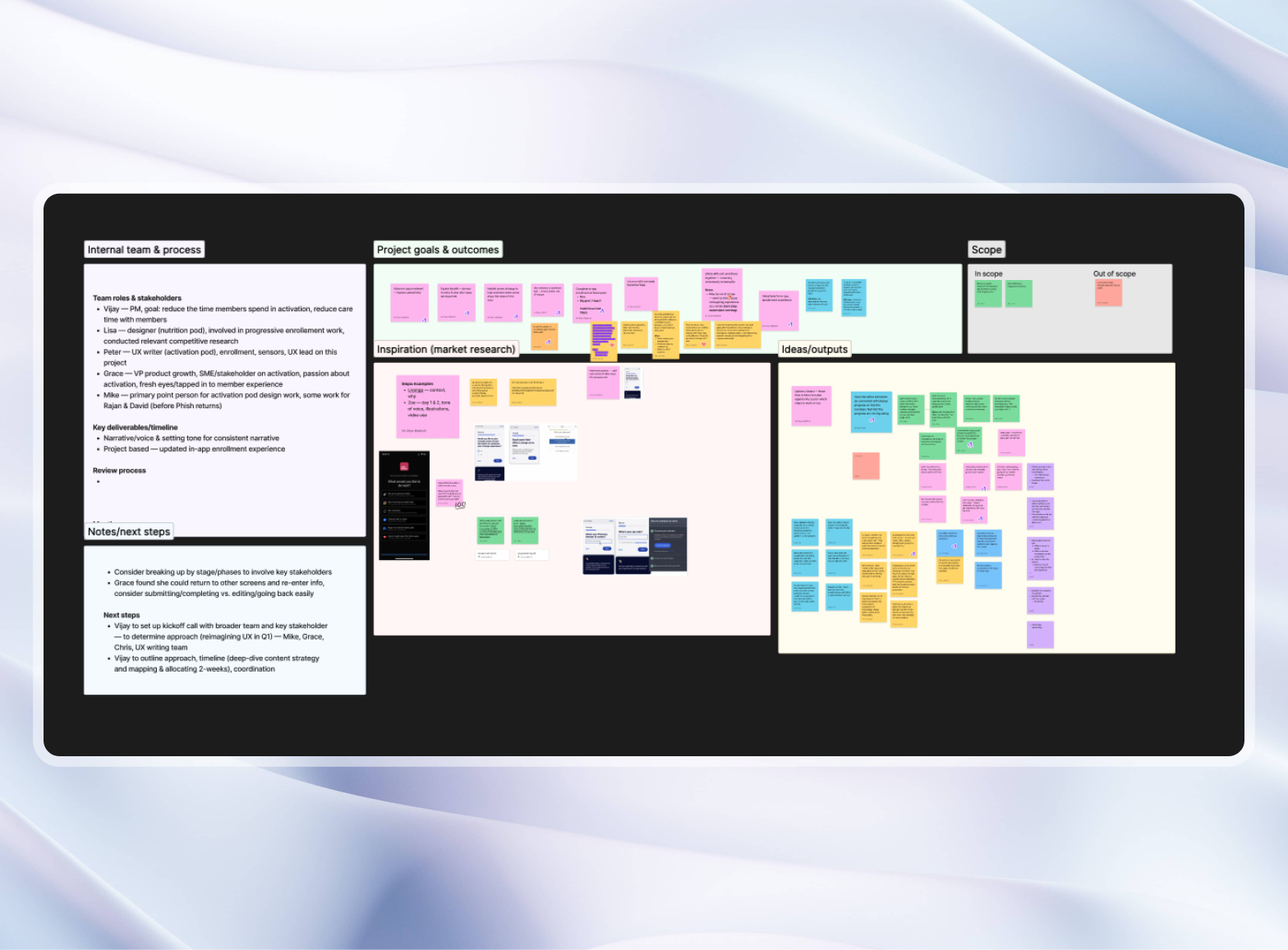
We wanted to know whether asking people to download the app before checking they were even eligible was costing us members. So for eight weeks we split 12,400 eligible employees at three employers evenly between two sign-up flows:
- Before (app first): the employer's email, mailer or QR code went straight to the App Store or Google Play, and eligibility was checked inside the app.
- After (web first): the same invitations opened a short web page where people confirmed they were eligible and took the health quiz, and only then downloaded the app.
What we found
- Enrolled: 8.2% of invited employees with the app-first flow, 12.9% with web first — about half as many again (p = 0.01).
- Lost at eligibility: 78% of people gave up at the eligibility step when it came after the download; 52% when it came first.
- Time to sign up: from about 15 minutes to about 7.
- Cost per enrolled member: from $122 to about $86, for the same campaign spend.
Outcomes
After we rolled web-first out to every employer:
- Enrollment: stayed about 50% above the old flow over the following quarter.
- Eligibility check: took about two minutes on average, down from about fourteen.
- Consultation show-up: rose from 58% to 71% once scheduling moved into the same flow.
- New employers: the reusable campaign templates cut the time to launch a new employer's portal from about three weeks to one.
Conclusion
Consumer health adoption hinges on meeting prospective patients where they are. By dismantling the friction of mandatory upfront app downloads and structuring enterprise marketing channels into a coherent, measurable taxonomy, we created an enrollment experience that is as welcoming and effortless as it is operationally robust.
Gallery
01 / 04From the gallery