Behavior Loop · 04 / 05 · design systems · ux research · Web
Accessibility Spec Framework
Reading order, focus order, names and structure drawn onto every component before it's built, and a 48-point check before handoff.
- Target
- WCAG 2.2 AA
- Audit Items
- 48-item gate
- Screen Readers
- VoiceOver / TalkBack
- Contrast Standard
- APCA Lc 75+ body
Overview
This is how accessibility was specified in Twin Health's design system — an annotation kit and a 48-point design checklist that put reading order, focus order, names, landmarks and headings on every component before it was built. Many members are older, some have diabetic eye disease, and some use screen readers, voice control or a keyboard alone; for them accessibility is part of whether the treatment works.
The problem: "WCAG 2.2 AA" doesn't tell an engineer what to build. Designs arrived polished but without the things a screen reader depends on — reading order, labels, where focus goes — and the result was confusing announcements, keyboard traps and expensive fixes late in the cycle.
What we built: A shared vocabulary drawn onto the designs themselves. Grey markers for the order things are read; numbered ink markers for where Tab stops; the accessible name beside each control; landmarks and headings outlined. And a checklist every design passed before handoff — states, contrast in two models, heuristics, and coverage of every user story.
Who it's for:
- Primarily: members with low vision, limited movement, or the cognitive load of managing a condition.
- Also: designers, accessibility specialists, and the web and mobile engineers who build the components.
Diabetes Reversal Program
Sponsored by your company's insurance
$8,000 – $10,000 a year
$0 to you while you're enrolled
- Tab into the card, or Read all.
The spec, working
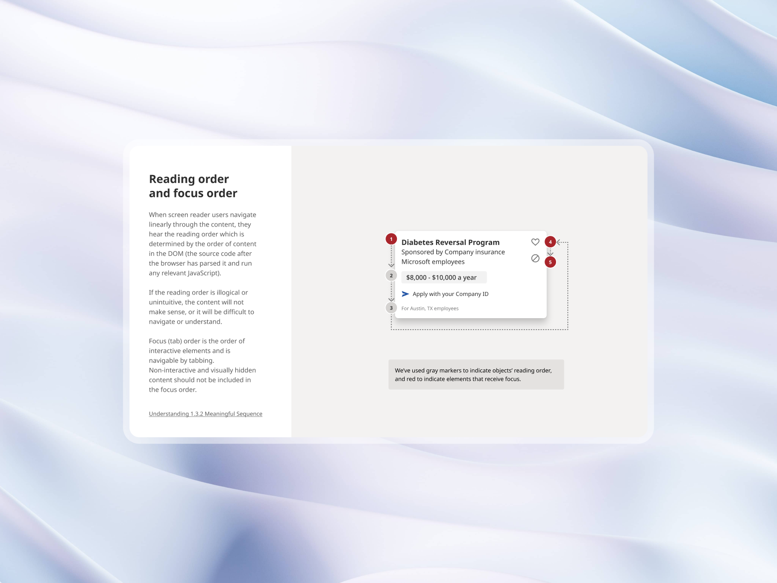
The sheet above is the spec on a real component. Turn the layers on and Tab through the card: the transcript is what a screen reader would say, worked out from the markup. The contrast panel measures this site's own colours, live.
What made it hard:
- Dense clinical cards. Several buttons, expandable charts and status chips in one card — and a screen reader user still needs to hear a story, not a stream of numbers.
- Grouped fields. Date of birth, doses and vitals ranges share visual groups; each input still needs its own name.
- A shared language. Designers had to be able to say all this in Figma without writing ARIA.
What every component specifies
Reading order and focus order (WCAG 1.3.2)
Screen readers follow the DOM, and flexbox and absolute positioning can make what you see disagree with what's read.
- Grey markers set the order non-interactive text is read — "Diabetes Reversal Program" → "Sponsored by your company's insurance" → "$8,000 – $10,000 a year".
- Numbered markers set the tab order for controls only. Text and decoration never take focus.
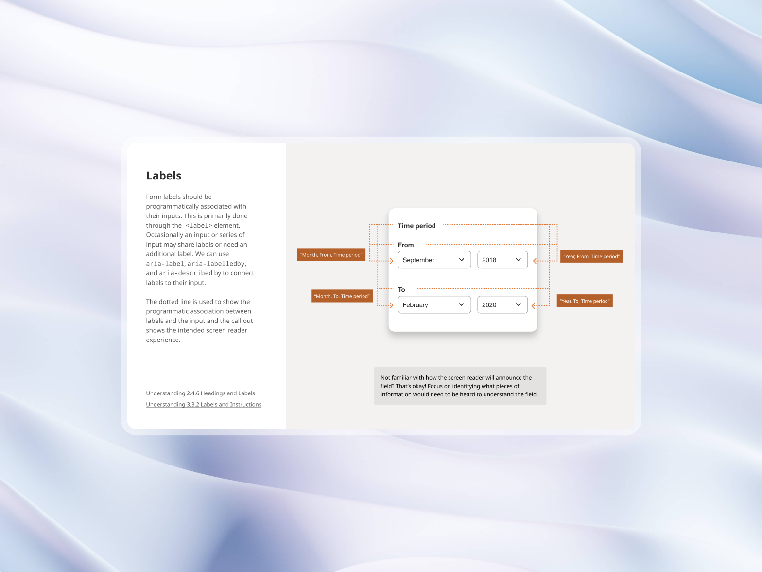
Labels (WCAG 2.4.6 and 3.3.2)
- Every input has a label, wrapped or linked with
for/id. - Grouped inputs build their name with
aria-labelledbyandaria-describedby— a From month in a Time period group is announced "September, From, Time period". - Errors are tied to their field with
aria-errormessageand a live region, so they're announced as soon as the field is left.
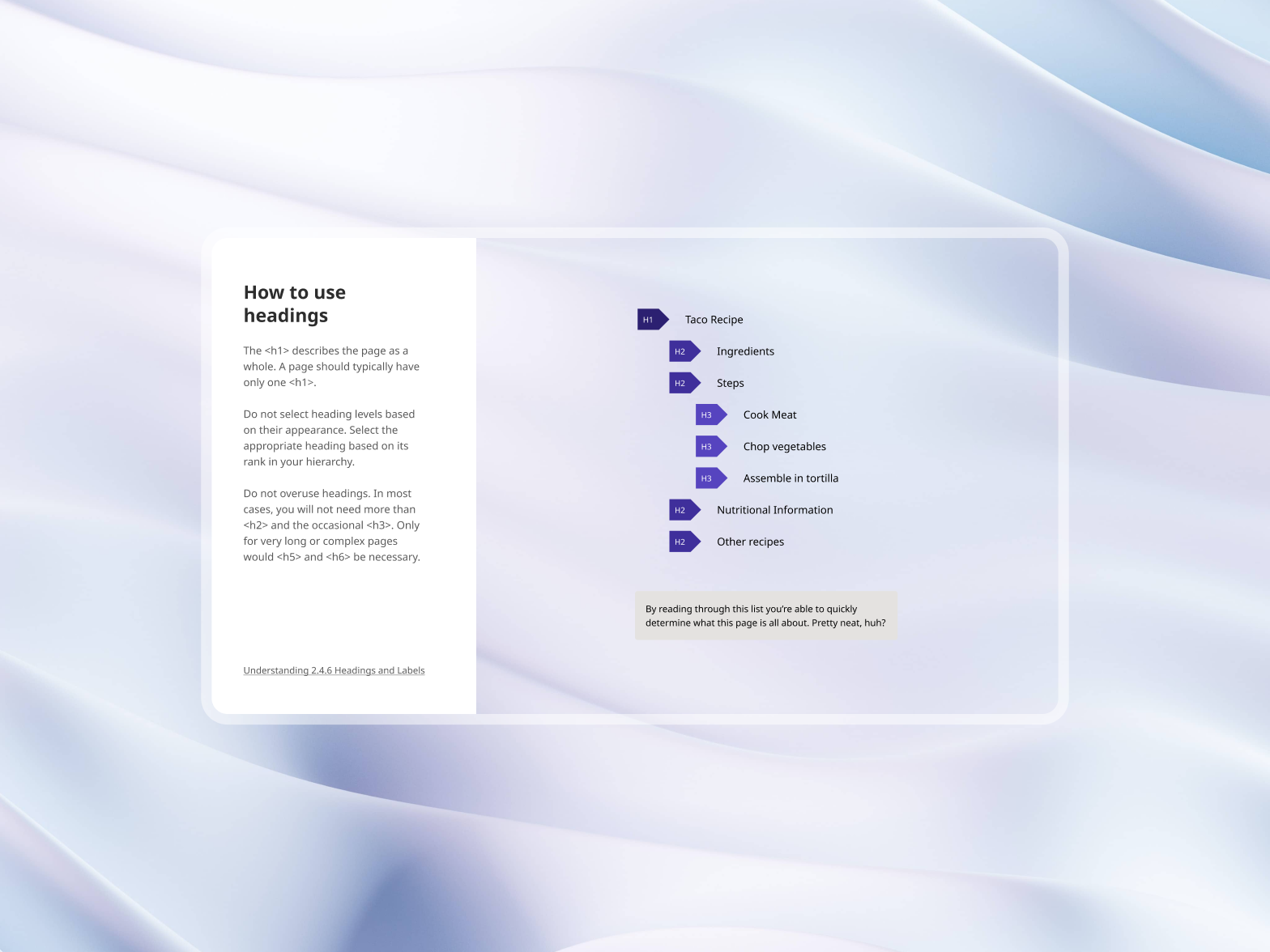
Headings (WCAG 1.3.1)
- One
<h1>per page, naming the page. - No skipped levels — an H2 section can't jump to H4 because a smaller type size looked right.
- Style apart from structure — type tokens are separate from heading levels, so a heading can look like anything without breaking the outline.
Landmarks
Every layout uses the same set: banner for the top bar, exactly one main, navigation for each nav (each with its own label), contentinfo for the footer, and search for search and the command palette.
Where it sits in the process
The 48-point checklist
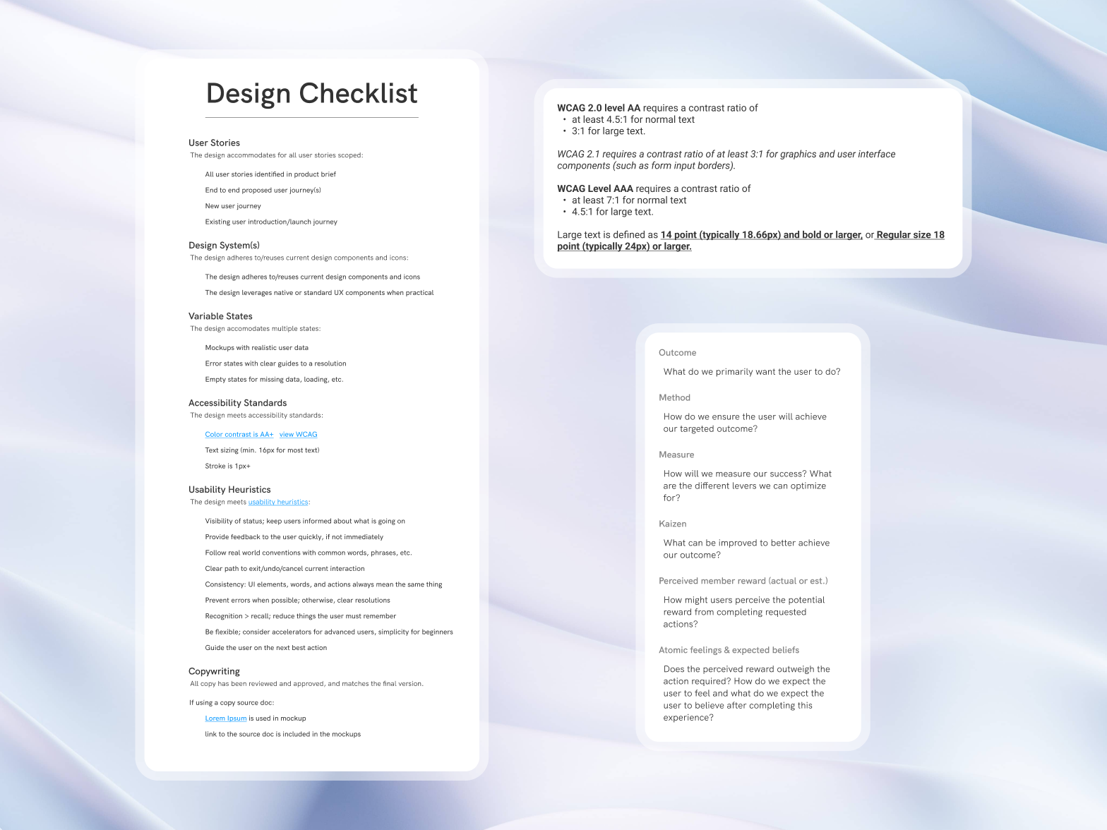
- Stories: every scoped user story from the product brief appears in the designs.
- Tokens: components use design tokens throughout; detached instances are flagged.
- States: default, hover, focus, active, disabled, loading, empty and error, with realistic clinical data.
- Contrast: text meets WCAG 2.2 AA (4.5:1, or 3:1 for large text) and APCA Lc 60; borders and status chips that carry meaning hold 3:1 against their surface.
- Heuristics: system status, immediate feedback, error prevention, and a way to undo or exit.
Results
- Audits: external WCAG 2.2 AA audits of the web and mobile apps found no critical issues; the few minor ones were fixed within a sprint.
- QA: accessibility bugs found in QA fell by about half, because components arrived with their labels and focus order already specified.
- Screen readers: blind and low-vision members in testing completed onboarding and sensor pairing with VoiceOver or TalkBack, most without calling support.
- Adoption: the annotation kit became the most-used template across design teams.
Conclusion
The standards didn't change; where they were applied did. Drawing reading order, focus, names and structure onto the design meant the decisions were made once, by the person who knew the intent — and engineers built them instead of guessing.
Gallery
01 / 04From the gallery