Health AI SaaS · 11 / 11 · design system · Web
Design System
One card, three tiers of tokens and a few chart rules, shared by the clinical portals and the member app on iOS, Android and the web.
Overview
This is the design system behind every Twin Health surface — the clinical web portals, the member app on iOS and Android, and the doctors' tools — built around one component, the Treatment Intelligence Module, or TIM. One set of tokens, one type scale, one way to draw a glucose chart, shared by design and engineering on three platforms.
The problem: Each platform had grown its own components. The same insight looked different on iOS, Android and the web; accessibility failures crept in one platform at a time; and the most important picture in the product — what a meal was predicted to do against what it actually did — was drawn three different ways, which confused clinicians switching between tools and members switching between devices.
What we built: A tokenised system with one card at its centre. TIM is a container with three slots — words, an insight chart, actions — that every surface is assembled from. Tokens come in three tiers, so a colour is named once for what it is, once for what it does and once for where it's used, and the platform code is generated from the last tier. Charts have rules. Contrast is checked in the build.
Who it's for:
- Primarily: product designers, web and mobile engineers, and clinical product managers.
- Also: clinicians and members, who get the same picture of their data wherever they look.
Good morning, Rajan
Yesterday's walk after lunch flattened your spike. Here's what it did.
- chart.predictedink.muted · dashed 4 4
- var(--chart-predicted)
- chart.actualbrand.activity · 2px
- var(--chart-actual)
- chart.band70–180 mg/dL
- var(--chart-band)
One card, four slots
In the prototype above, hover the card's slots, switch platform and state, and take the walk away to see the chart change.
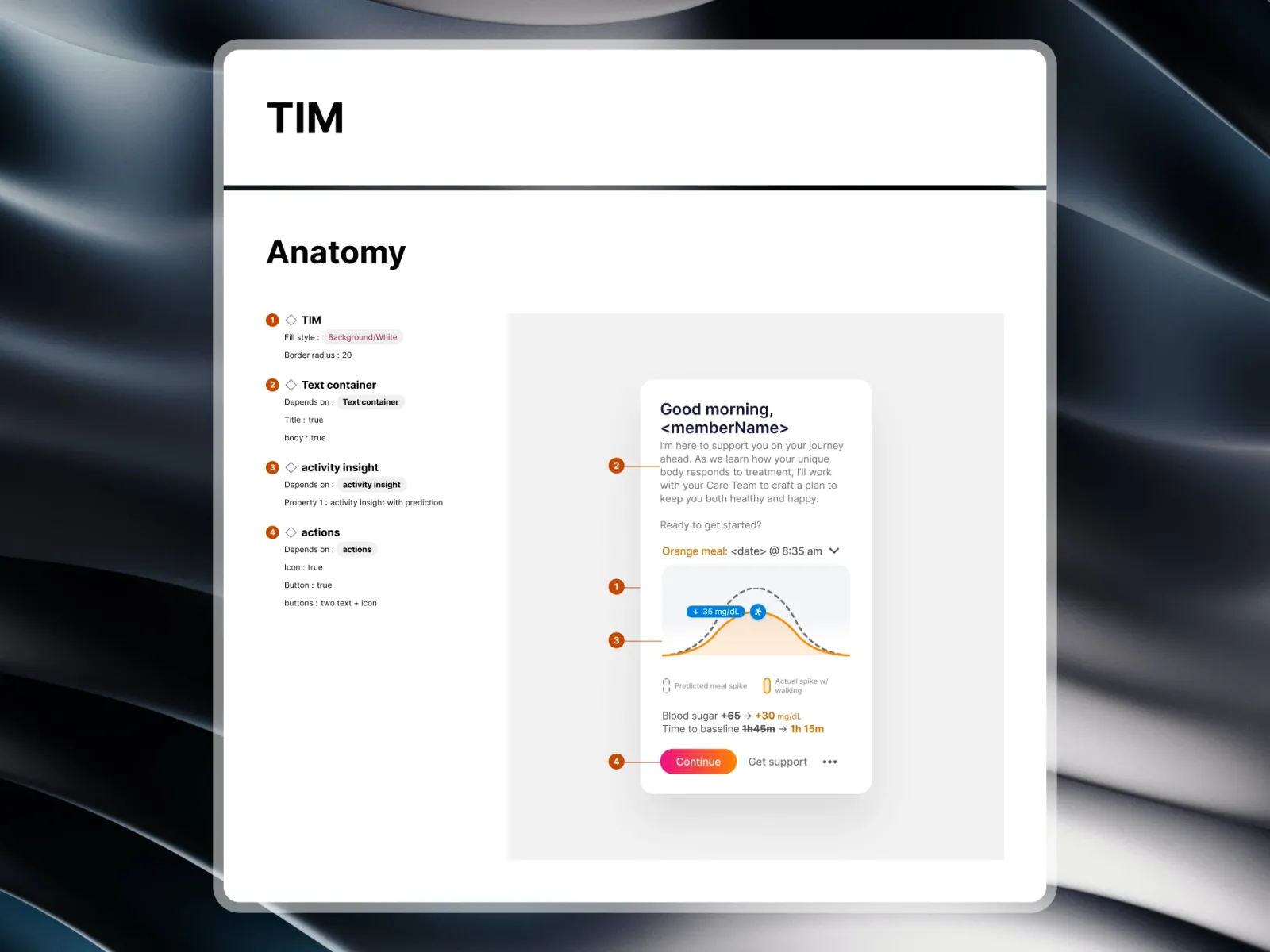
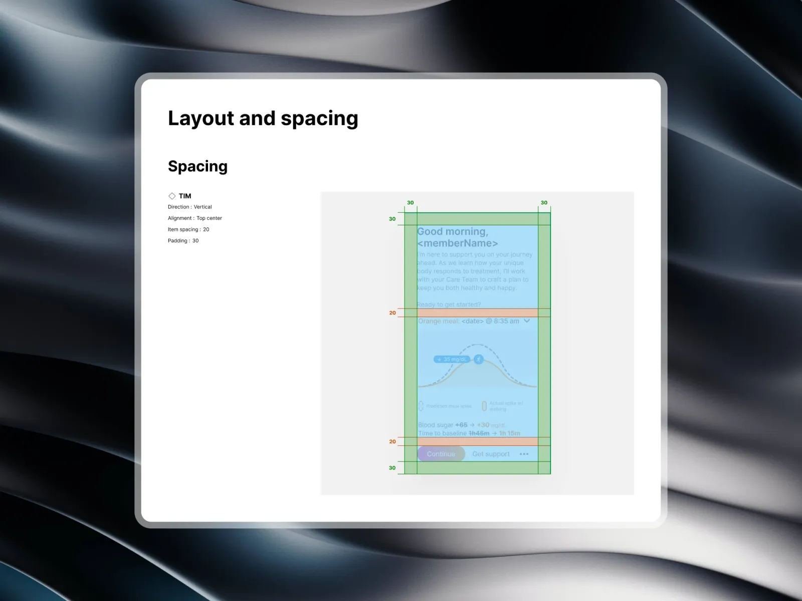
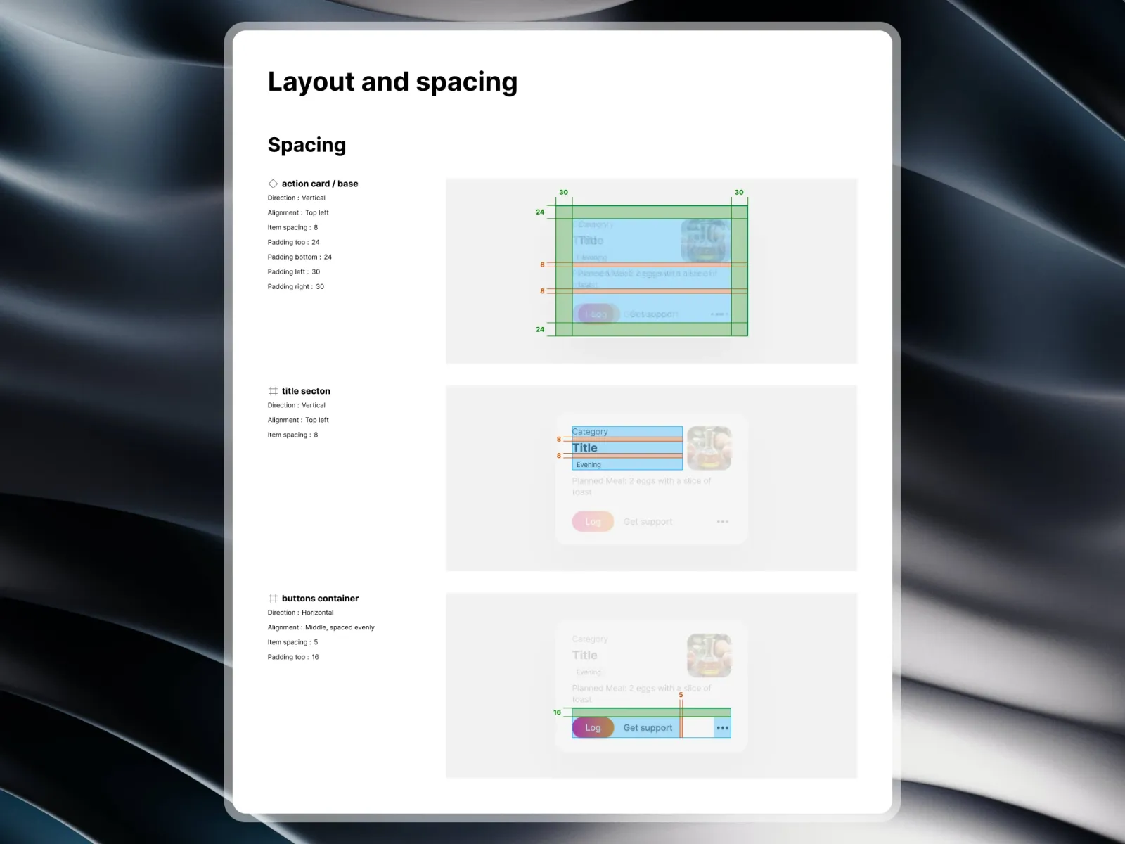
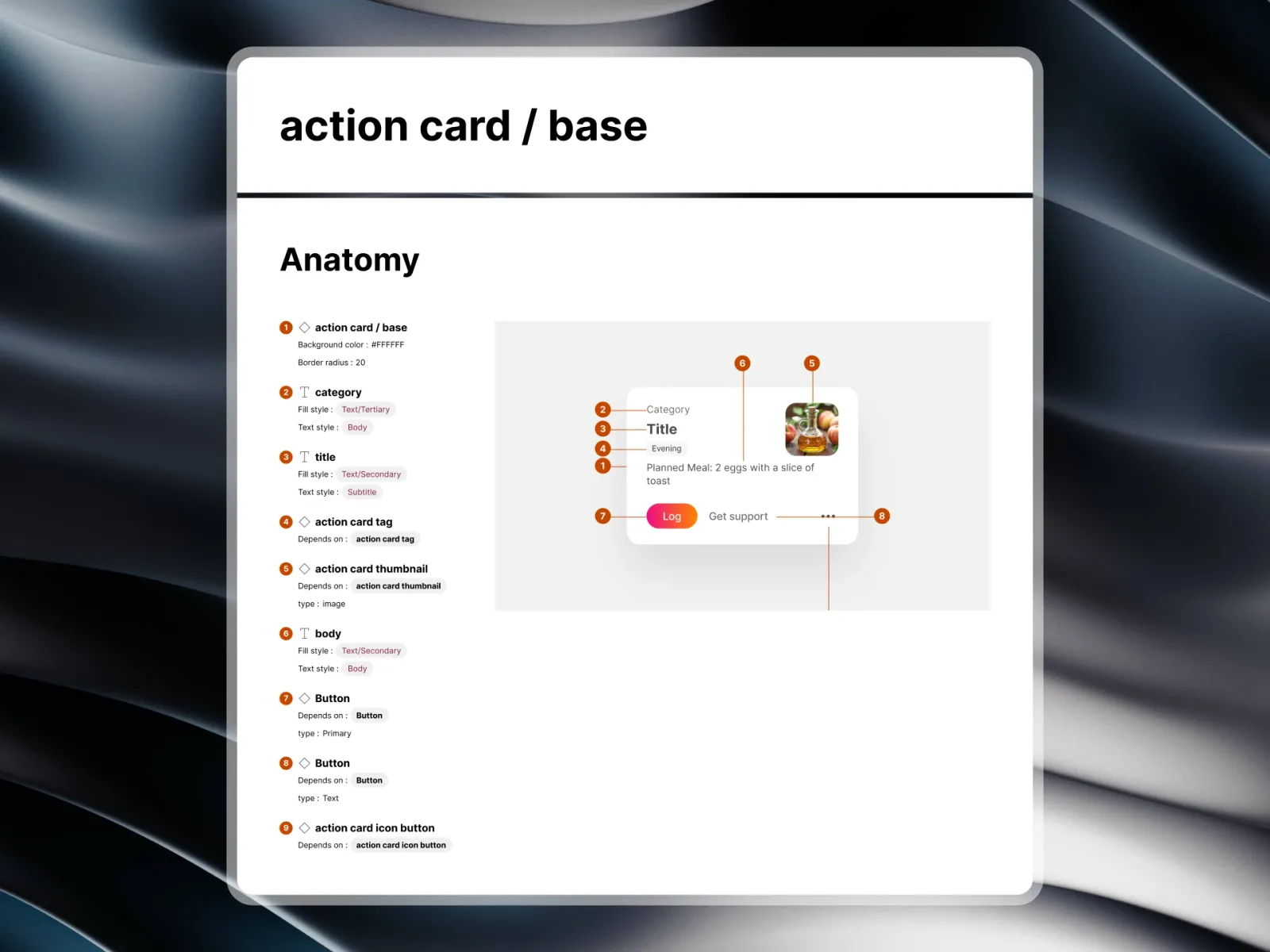
- Container: 20px radius, the raised surface, 20 of padding and a soft shadow — set here and nowhere else.
- Text: title and body styles with personalisation built in — "Good morning, ‹memberName› — I'm here to support you on your journey" — so no screen hand-writes its greeting.
- Activity insight: the dual curve. A dashed line for the predicted spike after a meal, a solid one for what actually happened after a walk, and chips for the difference — ↓ 35 mg/dL, +65 → +30, time to baseline 1h 45m → 1h 15m.
- Actions: a primary Continue, a secondary Get support and an overflow menu, in that order everywhere.
The hard parts
- A chart non-specialists can read: two curves — what would have happened and what did — without either being mistaken for the other.
- One structure, many jobs: a greeting, a time series and a button cluster in one component, without it turning into a kitchen sink.
- Three platforms, one value: React on the web, SwiftUI on iOS, Jetpack Compose on Android, all reading the same tokens.
- Accessibility at scale: text, charts and status chips meeting WCAG 2.2 AA in light and dark mode, checked automatically.
Tokens in three tiers
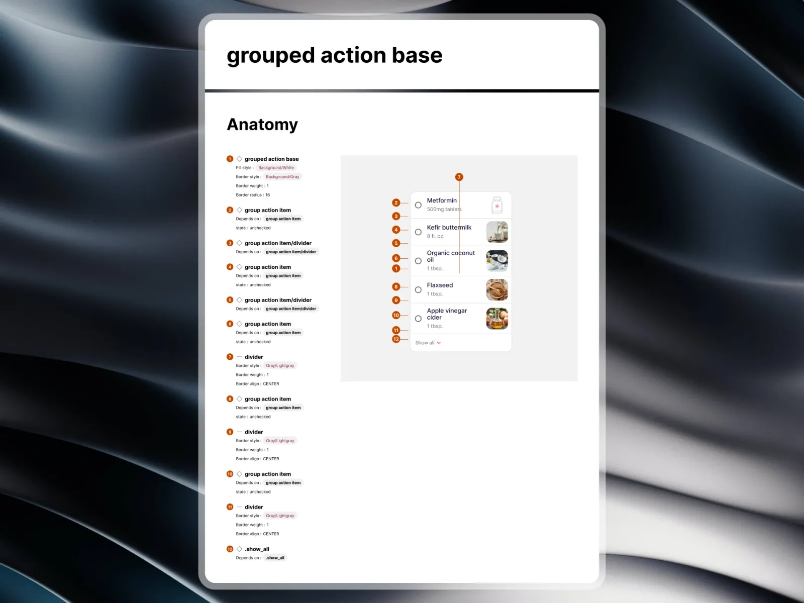
- Primitives are named for what they are — a blue, a step on the spacing scale.
- Aliases are named for their job — action.primary, in both modes.
- Component tokens are named for where they go — tim.button.primary — and are the only names a component knows.
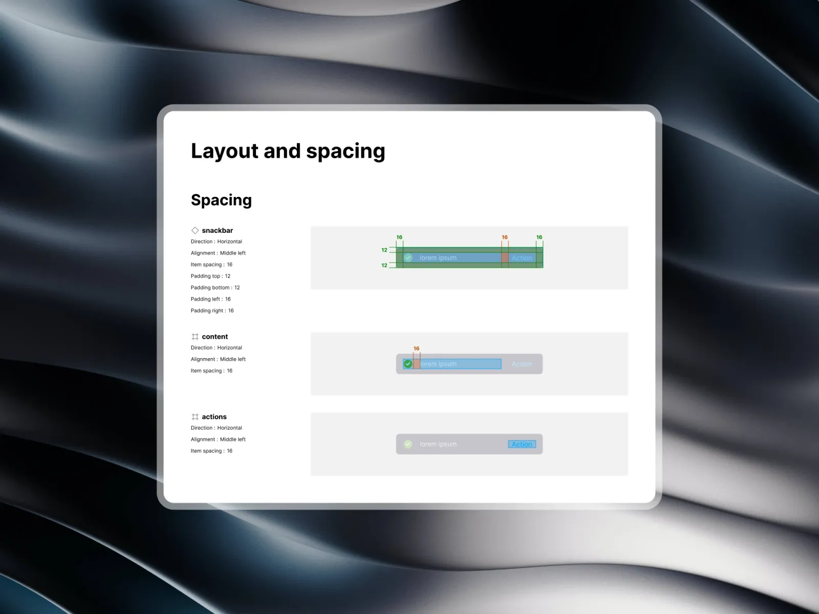
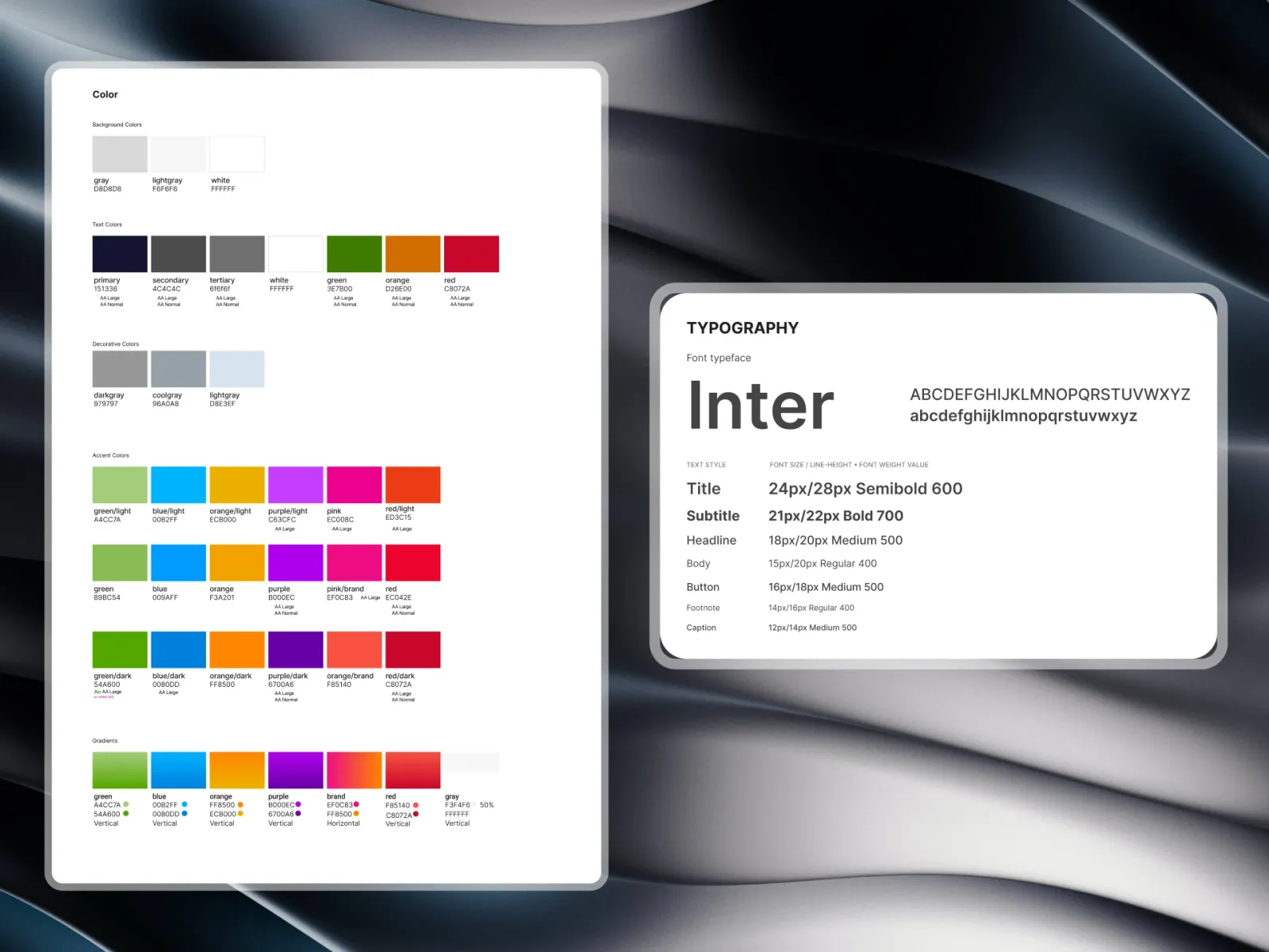
The palette gives each colour one job: a medical blue for actions and trust, an orange for activity and live readings, a green for in-range and progress, and a red kept for clinical escalations alone. Spacing runs on a 4px grid (4, 8, 12, 16, 20, 24, 32), and type on four weights — 400, 500, 600 and 700.
Chart rules
Medical data has to be read one way only. Time series, sparklines and glucose bands follow one set of rules: the 70 mg/dL and 180 mg/dL thresholds are always drawn as faint reference lines, and walks, medicines and sleep are marked with the same icons everywhere.
States and documentation
Every component's states — hover, focus, pressed, disabled and the skeleton shown while data loads — are specified with keyboard order and ARIA roles, in a Figma library kept in step with the code.
Results
- Design and engineering: about a third less back-and-forth per feature.
- Quality: UI bug tickets fell by about a quarter in the two quarters after rollout.
- Clinicians and members: the same chart, drawn the same way, on every screen they use.
Conclusion
The system works because there is less of it than there looks. One card, three tiers of names and a handful of chart rules carry most of the product — and when a value changes, it changes once.
Gallery
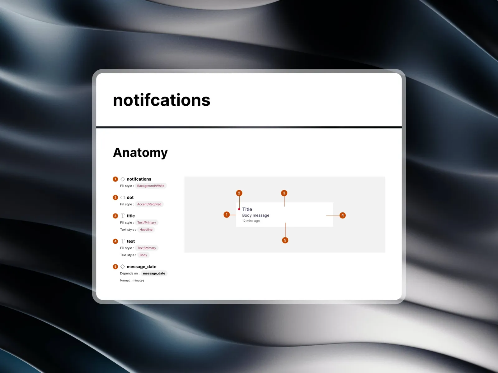
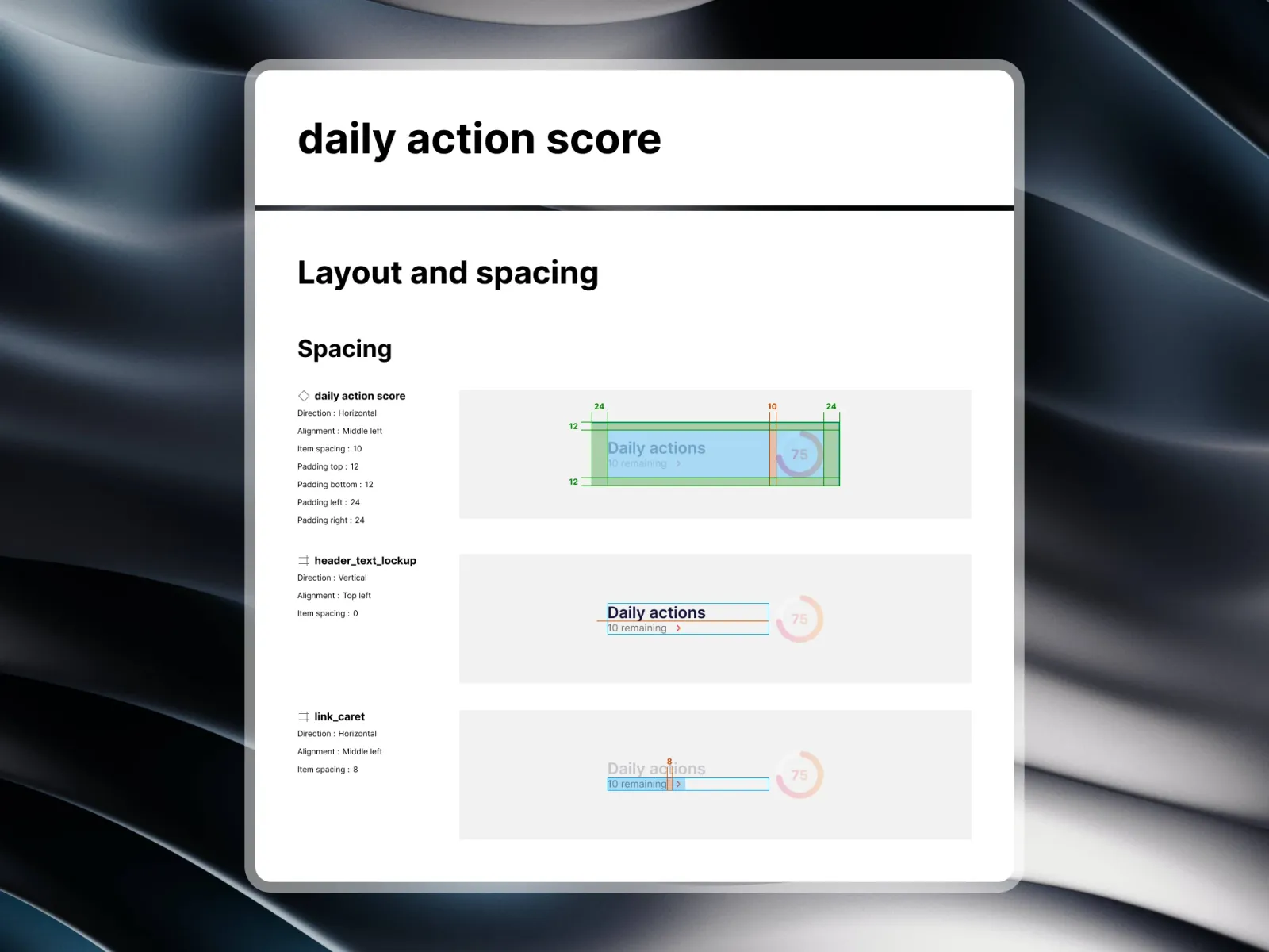
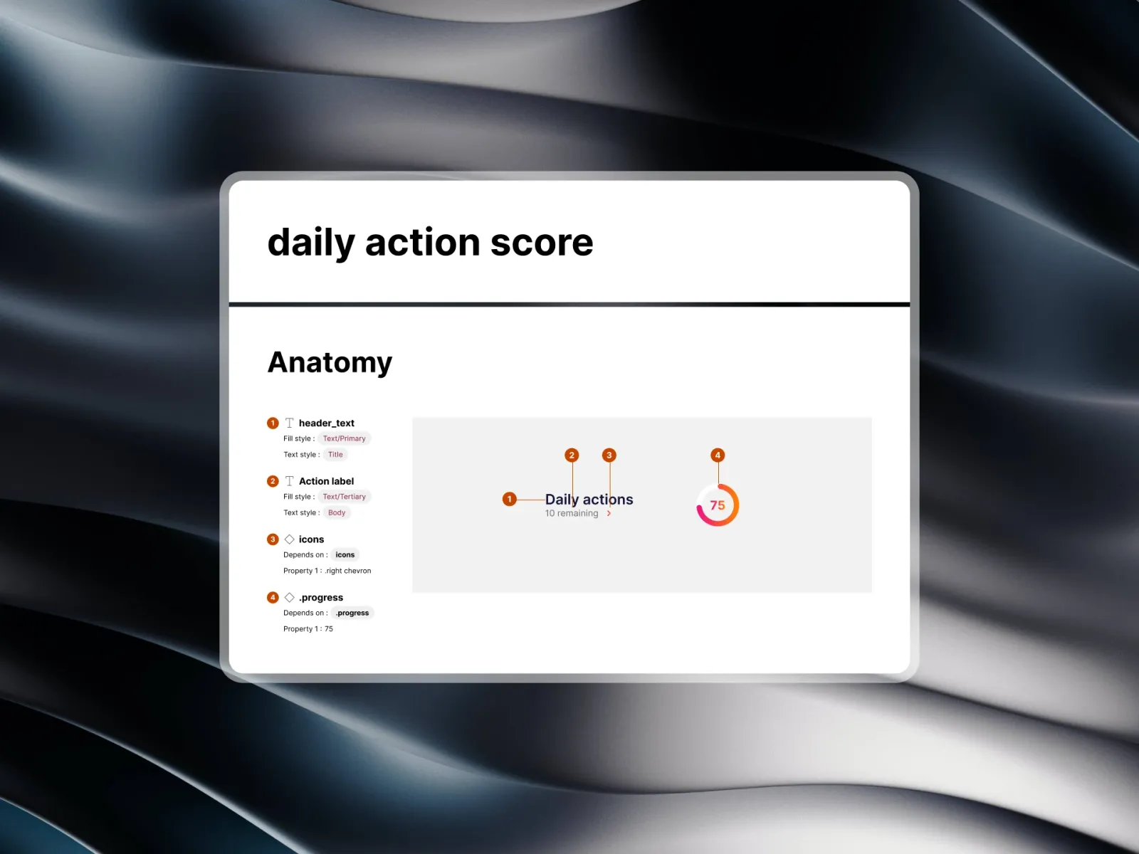
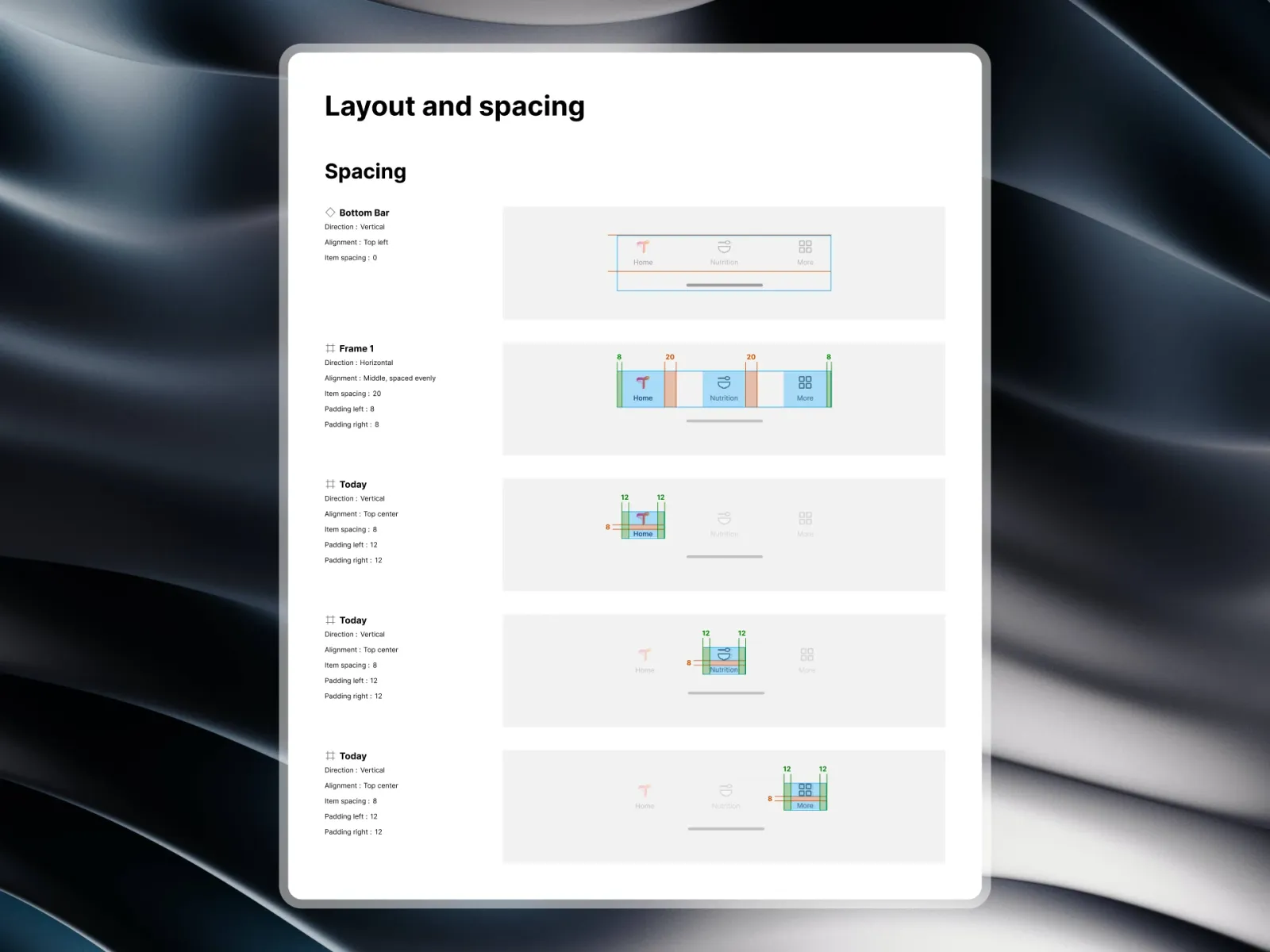
01 / 16TIM — The root container: 20px radius, raised surface.